Can you tell me/us a bit more about the new ink formulation ? (I understood the concept of the steric stabilization)
1 - What are the shades concerned by the new ink formulation ?
2 - When did you change it ? (so I can track the ink bottles with date/lot)
3 - Do you recommend new values for blending Cool & Warm curves on matte and photo paper ?
It seems that I now get more latitude between the cool and the warm color, cool ink is cooler, warm is unchanged.
Anything with a LOT# from Mid-2017 on. All Pro (Dark through Very Light) got the treatment.
I did art-print tests with this ink and the % was the same for the blends but this may be because the fresh ink that I test with is generally the same color (especially on the cool side). Basically this formulation change ensured the ink that [what] I test with internally remains exactly the same [as what other people print with] externally for several years. So you may need to add 2% more warm . . .
Correct me if I’m wrong but as I understand it, the cool shift could be explained because the pigments of the old ink settled in the cartridge and then as the cartridge level decrease, the % of blue pigments increase.
If this is the case this overblue shift shouldn’t be permanent and will be “stabilized” while filling the cartridge with the new ink ?
It’s the opposite actually. The old ink decreased in blue too much IMO: especially during international air-freight travel. This ink maintains the correct color with no drops in blue and no increase in magenta over time.
With regard to ink changing over time, with this new formulation, is shaking the carts still a good idea and what is best practice ? At the end of an Inkjet Mall video Dana shakes carts and the narrator explains to do this every two weeks https://www.youtube.com/watch?v=aiTLMlBNfcg. Is this still a good idea ? I’ve been doing it on a 9900, waiting a day to make any prints. If I do not have a regular print project ongoing I will make a 6 x 8 print daily or every other day to draw that ink through the system and have the ink in the lines, dampers and head be agitated.
Still working on getting the best results since the ink change.
I’m finding that printing with an ICC (the older one or the new one) result in a “big” loss of details.
Everything was fine before but I have hard time to keep my details when rgb values get under 15 (that’s was not a problem before).
Both Cool and Warm curves (blended in Print Tool) are perfectly linear.
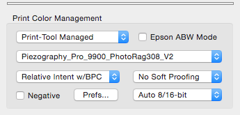
Make sure you are printing with Relative Colorimetric Black Point Compensation if this is a new style ICC. Print with Perceptual if this is an old-style ICC.
I re-linearized Cool and Warm, blended them in Print Tool, printed a target, measured it (perfectly linear), rebuild an ICC from it, re-print a test image with the new ICC, I get the same results.
Everything below RGB=15 is so dark that I have almost no details in it on the print.
I know I could play with the curves so darkest tones prints lighter but I never had to, everything was fine before, the image didn’t changed.
Please let me know if anything has changed in your system. Have you changed OS? etc. If linearity is verified and you are using the same ICC this is a software issue and not a hardware or liquid issue.
As far as I can remember I did no change in the system, no OS update or anything.
Only change I did is that before I was used to work with QTR Linearize Quad for the linearization and now I use the Piezo Pro Tool but I’m getting perfectly linear curve in both case so I don’t think it’s a problem.
Do we agree that the texture of the wall (mostly the upper part) in this test image should be clearly visible on the print ? (I’m beginning to be paranoïd ahah)
So you _have_changed the process by moving to a new ICC profile system. This system has a different “transfer” curve compared to QTR. Please shared the screenshots of what your print rendering intent is for printing with the new ICC. It should be Relative Colorimetric w/ BPC.
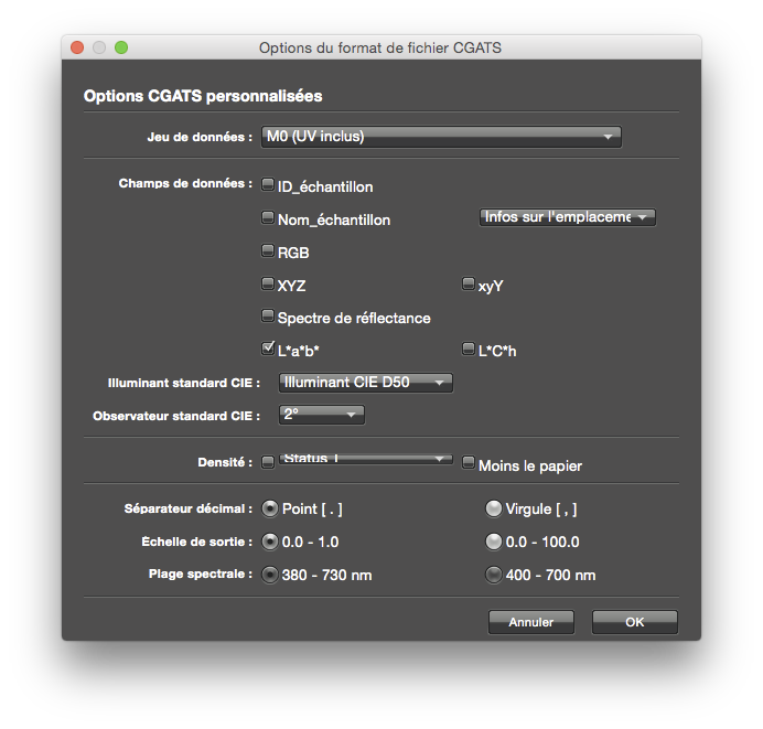
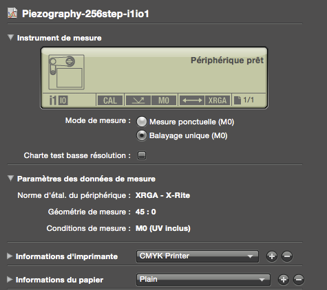
And also please share the screenshot of the measurements you used when building the ICC.
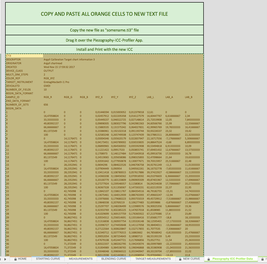
Here they are.
Note that I’m using “,” separator because Excel don’t want to read the values otherwise.
Then I copy/paste the ICC data and replace the “,” by “.” to make it work with the PiezoICC Profiler.