Greeting,
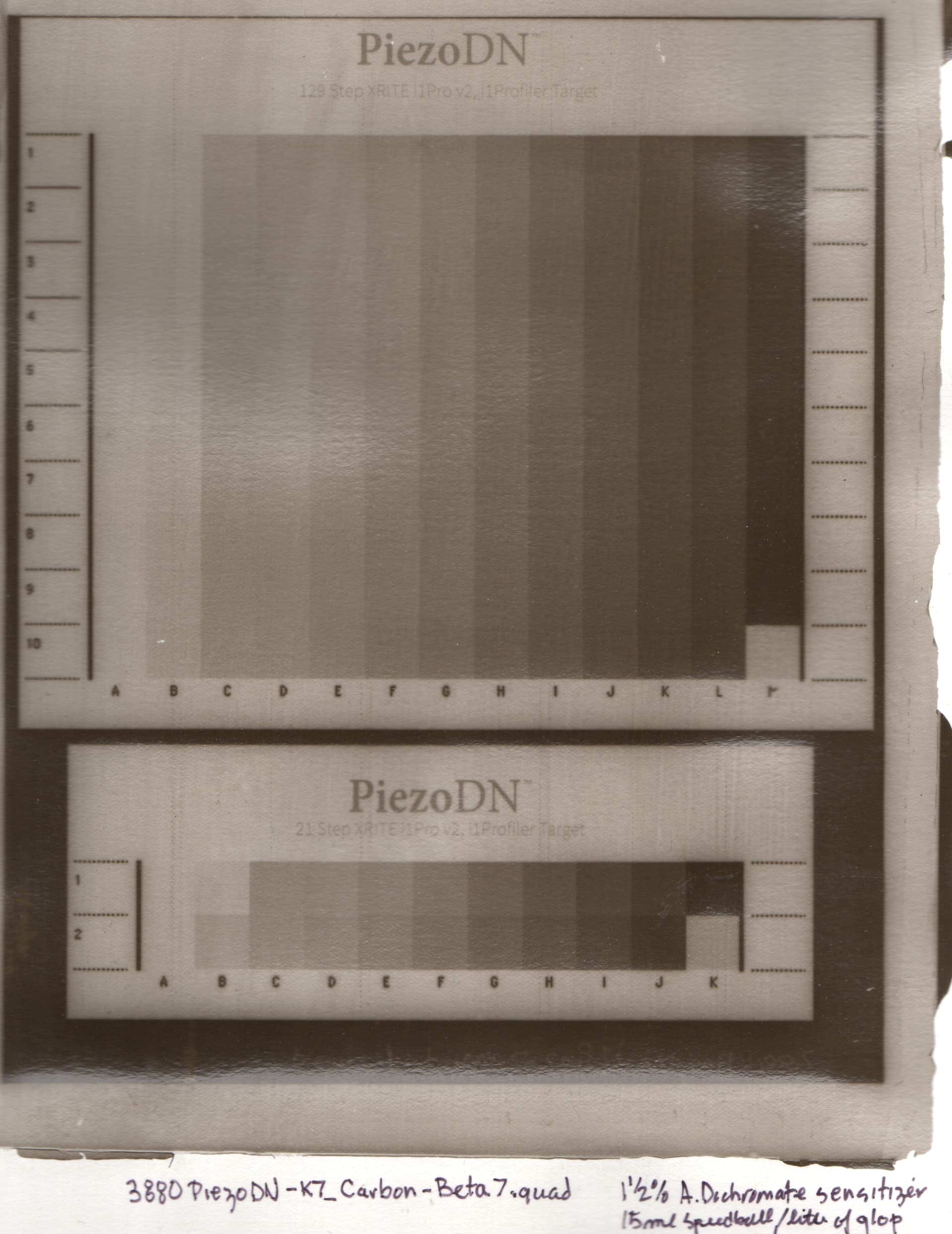
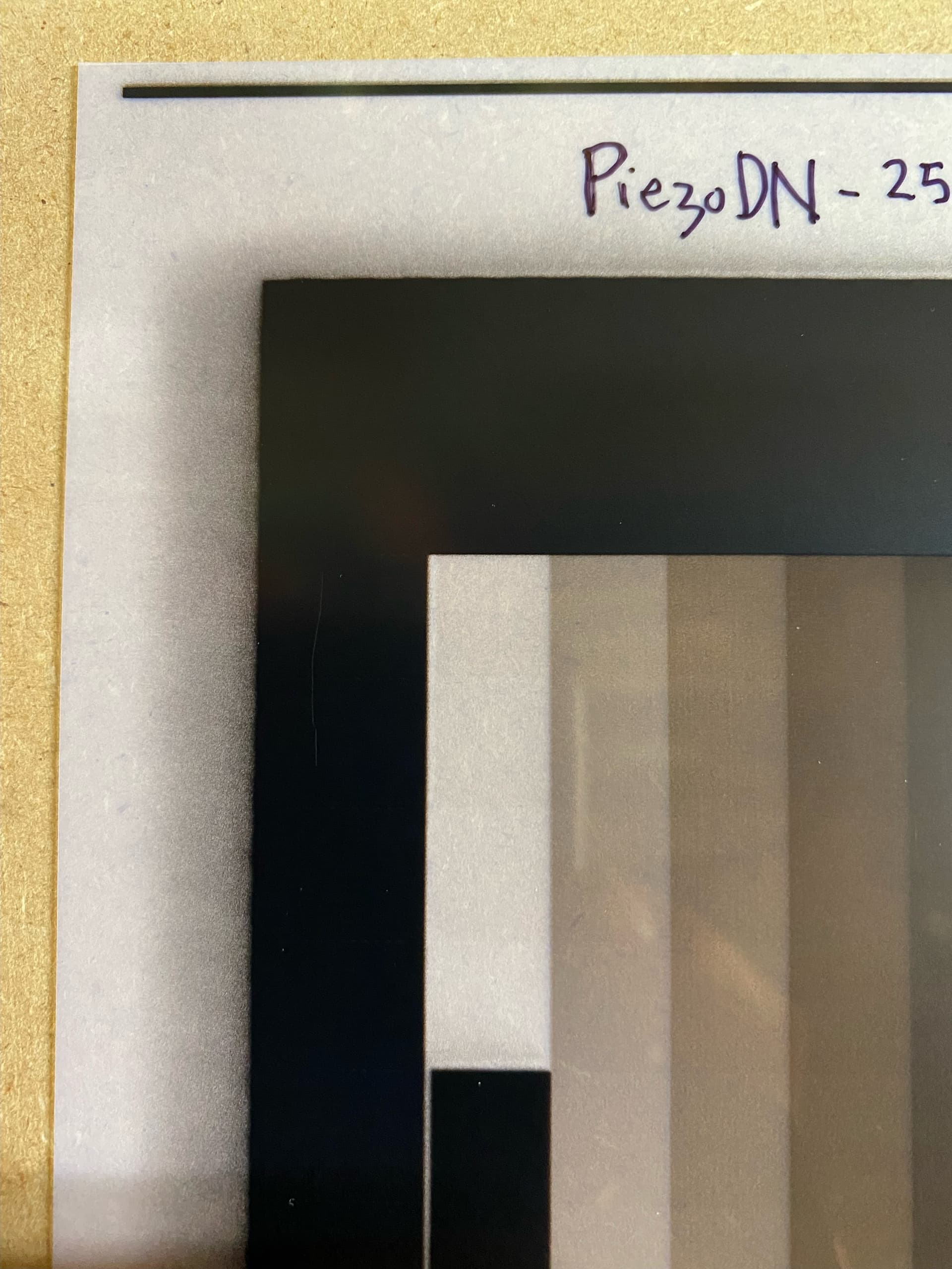
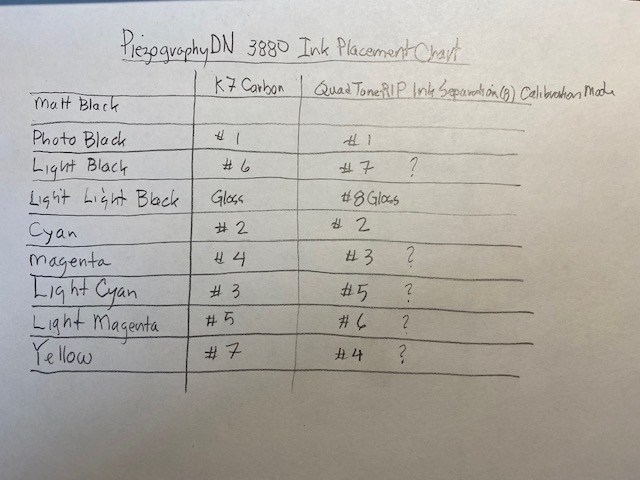
I noticed that the ink placement for K7 Carbon Inks for the Epson 3880 is different that what seems to be the case in the 8 ink QuadToneRIP ink separation chart. Is this a problem? Attached is a chart which shows the different ink placement.
Hi John,
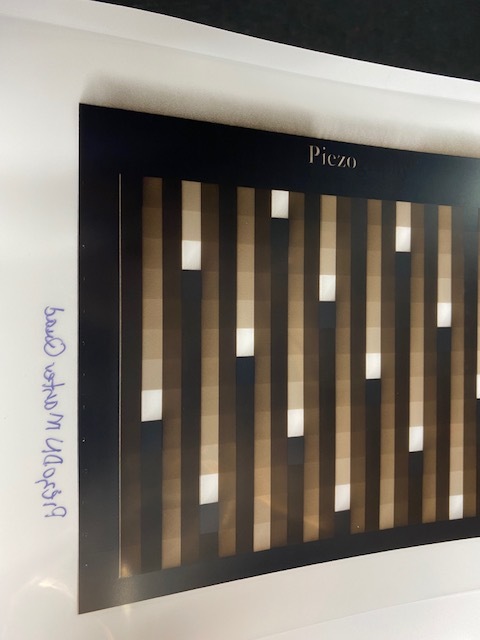
The ink positions in the K7 Carbon column of your handwritten chart are correct. Don’t let the Ink #s on the QTR Calibration target confuse you – they do not refer to Piezo ink shades. (I think they are used in QTR generated profiles which we do not use with Piezography.) Use the color channel labels to correlate with Piezo ink shades.
I don’t do carbon transfer myself, but I have been working with a friend who is learning it. He is using my old 1430 with K6 Carbon inks, and I am making profiles for him since that part is beyond his computer skills. It has been quite a challenge. We have been through 7 iterations so far and are finally getting close to something useful. This is partly due to the fact that he is new to the process, though he is a very skilled darkroom printer in several other processes, and partly due to my surprise at how short-scale the process is and having to do quite a bit of manual work to the individual channel curves. He told me just yesterday that v7 of the curve is looking very close and even better since he cut down on the dichromate a bit. I should be receiving the test samples for reading and further adjustment next week sometime.
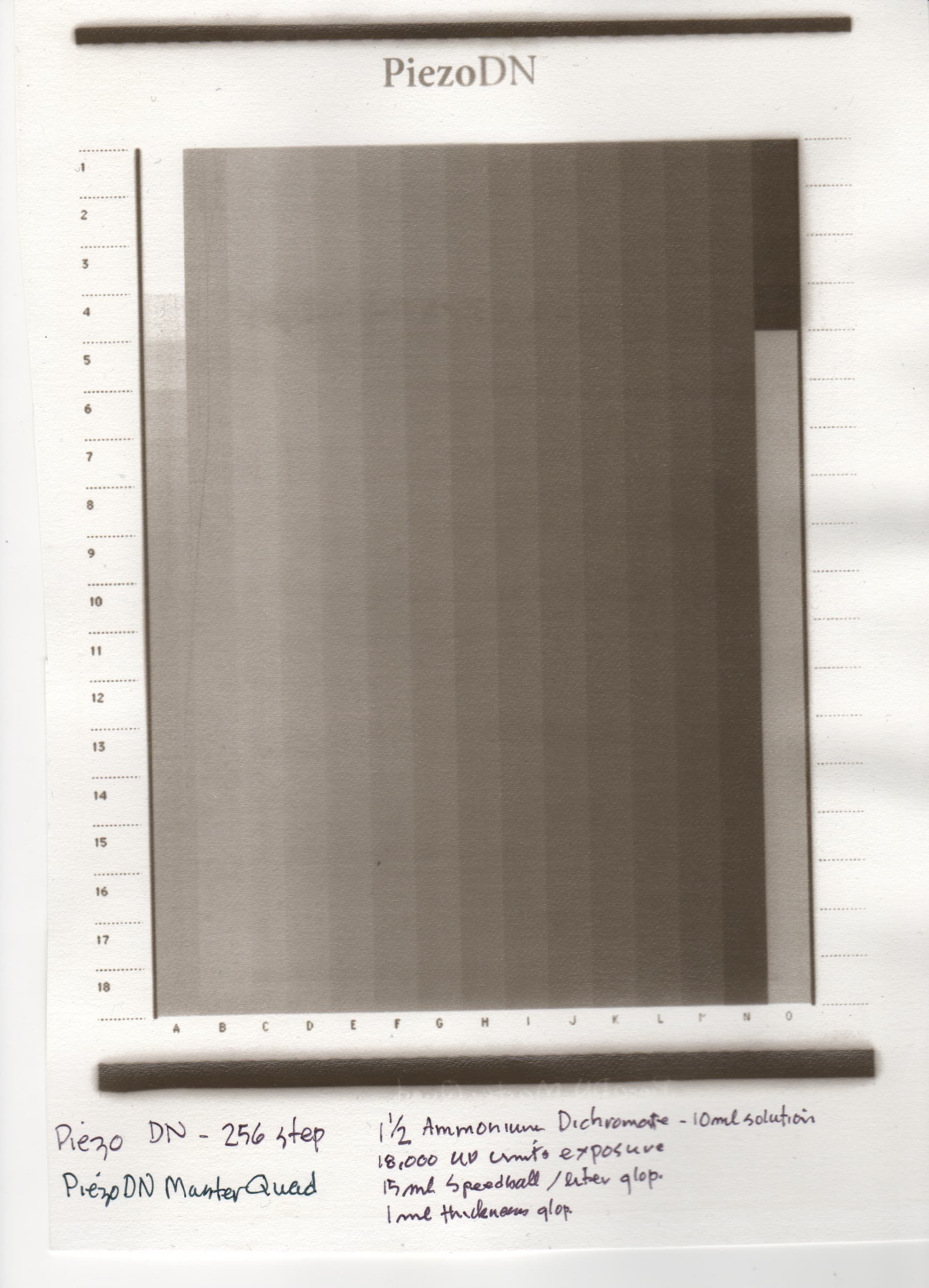
One thing I can tell you now is that ink levels for the darkest inks had to be cut way down. Curve view of the last iteration looks like this:
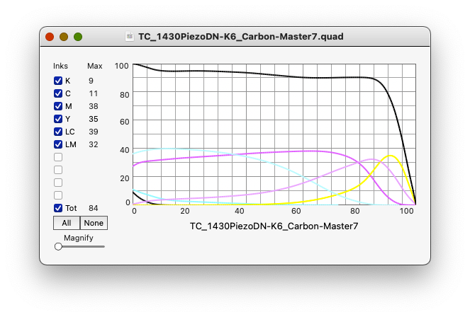
This is a 1430-K6 curve, not 3880-K7, so it’s not a direct translation. But 3880 PiezoDN curves do not use shade 7, so they are 6 channel curves in practice. The only channel/ink position difference is that shade 6 is in the Y position on the 1430 (which has no LK or LLK) while it is in the LK position on the 3880. Ink droplet size is different as well, but I’ll share the curve with you if you want to give it a try. I would need to alter it for compatibility with 8-channels. Let me know.
Cheers,
Keith
PS – Atigun Pass, north side I think. I was there in '98. https://jkschreiber.wordpress.com/portfolios/wider-view-segmented/#jp-carousel-674
PPS – I remember a John Penner from college at the University of Arizona in the early '80s.
Hi Keith, I have been trying to develop a K7 Carbon quad for my carbon printing process for months and have gone down the sequential quad fine-tuning path a number of times with limited success. So if you could share a carbon quad file with me that would work or be a starting point for me (I started with the Master quad), that would be much appreciated.
On another note, I looked at your Alaska photos, and they are beautiful. Not sure how you produced them. If they are 4x5 contact prints fitted together, you must have had excellent camera control. I live in Saskatoon, Saskatchewan, Canada. I explored Alaska in 2012 and hope to produce a carbon print exhibition of photos I took in Alaska, the Yukon and the Northwest Territories.
Hi John,
Thanks for sharing those links – beautiful work. The Prairie Landscapes feels like reading Wallace Stegner to this old southwest desert boy. The White Yukon slide show reminds me of the 4 road trips to AK and YT (via BC and AB) and even into NWT on the last one in '98. But I’ve never been there in winter!
My work was on 8x10" film using a tripod fitted with leveling base and panning head instead of the usual pan/tilt head. Prints are palladium. I had to give up the big vacuum easel when I moved from Tucson to Taos in 2005 so all of the segmented panoramic prints were made before that. I’ve been trying to work with an old 7x17 banquet camera more recently, but that has been a bit of a nightmare.
About this Carbon Transfer quad: My friend actually got me involved to work out the digital negative side last January. He wasn’t yet quite settled on some of the darkroom aspects such as paper, pigments, dichromate level, &c., so there have been a few detours along the way but we are getting very close now. He started on Fabriano Artistico, tried a few other watercolor papers, and even Yupo, and has now settled on fixed out photo paper. I’m not sure about his pigment mix but I think he finally understands why I have been nagging him to choose something and stick with it at least until we get a quad good enough to call the Master. At his suggestion, on the last couple of iterations I lowered the Dmax way down to help reduce (or hopefully prevent) frilling, and it seems to have helped. Finally, on the current round of tests, he reduced the dichromate level (I can’t find his notes on that but will get the details asap) and says that it helped lessen or eliminate the grit he was getting in the last few steps to white.
I can’t promise this will work for your system and working methods, but here it is and good luck:
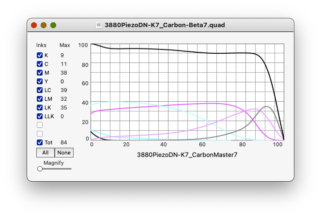
3880PiezoDN-K7_Carbon-Beta7.quad (7.7 KB)
Note: I found a flaw in this curve that probably lowers Dmax slightly by applying a little ink (Shade 4 - Magenta channel) in the last step which should be clear uninked film. Here is a corrected version:
3880PiezoDN-K7_Carbon-Beta7a.quad (7.7 KB)
And a screenshot of the QTR-CurveView:
I look forward to hearing your thoughts.
Cheers,
Keith
1 Like
Hi Keith,
I tried the Quad file you sent me. The resulting negative looked flat and lacked density. I made a carbon print which verified my assessment of the negative. I have included a scan of the print for your reference. Thanks again for letting me test your quad file. Just to be clear, I have pretty much standardized my darkroom setup, and have been exposing at a regular 18000 UV exposure units at a 1 1/2 % Ammonium Dichromate concentration which should give me a good contrast. So I will go back to the PIezoDN Master quad and test with the 256 step scale and my i1Pro2.
Walker Blackwell suggested doing a manual adjustment of the quad curve so that the highlight and dark areas would both print. I am not sure what the process is for manual adjustment. If my contrast is too great, I can perhaps increase my sensitize concentration.
Years ago I took a carbon printing workshop with Luis Nadeau and used some of my 4 x 5 negatives. No problem there. I have built my own 8 x 10 camera, but have yet to test it out. On your web site you said that you used mostly film negatives, perhaps this is the way to go. Producing a linear quad file for carbon printing has been quite a challenge, but then I am not that well versed in digital print technology - a steep learning curve for a senior.
Thanks again, and perhaps we will meet some time.
jjp
You’re shadows look but highlights are dark. So I suggest printing the 21x16 step target and calibrating with Piezography Professional v2 software with the data from that color port target. It’s gonna help you a lot.
-Walker
Hi John,
Granted this needs to be linearized to your particular way of working, but I think it looks quite a bit better than what you posted back on 11/28 and 11/30. It’s hard to compare the picture of the latest test to your earlier ones because the lighting is very different, but it looks to me like you have a full range of tones where you did not before except for maybe the 11/5 example above.
Having said that, I took another close look at the quad I shared and found a flaw that I had somehow missed earlier. I think it is likely responsible for the slightly veiled shadows which appear to result in a lower Dmax. The lightest step in all channels (step 256 of each channel) should be zero in the quad, but in the Magenta (shade 4) channel it was 8. I have changed the last 2 values from 14 and 8 to 10 and 0. You can do this manually in your text editor or try this revised curve if you want.
3880PiezoDN-K7_Carbon-Beta7a.quad (7.7 KB)
Your earlier test are quite similar to where my friend and I started out on this journey. Extremely blown out highlights, becoming less blown out but still very gritty until the last couple of iterations. If smooth highlights are something you like I believe this is the right path. I suggest following through with this and linearizing it, then modify that to suit your taste if you want more contrast in the highlights.
Good luck whatever path you chose.
Keith
Thanks Keith. I will try Walkers suggestion first. I have printed a 256 step chart which seems to have a petty good gradation, and then use my i1Pro2 to analyze it and produce a new quad. It may be that the higher step chart (256 instead of 129) will give me less false readings. And thanks for pointing out that I can use the text editor to manipulate the input or output values. I think this is what Walker was suggesting to manually manipulate the highlight values and dark values until I could get both to print properly and then adjust the midtones through the normal linearization process. I will try the regular linearization process first and show you are he results.
Jjp
I suggest the 21x16 step chart so eliminate step-wise problems (jagged readings).
-Walker
Hi John,
I’m sorry if I gave the impression that I disagreed with Walker’s suggestion. I think they are complementary. Fewer steps will effectively smooth out the jaggies that come with the closer spacing of targets with high step counts. The greater precision they provide comes at a cost. The ability to get 16 21-step series from a single target print that you can average can be really useful. BTW, that target is in the Piezography Targets folder, not the PiezoDN Targets folder.
Cheers,
Keith
Greetings,
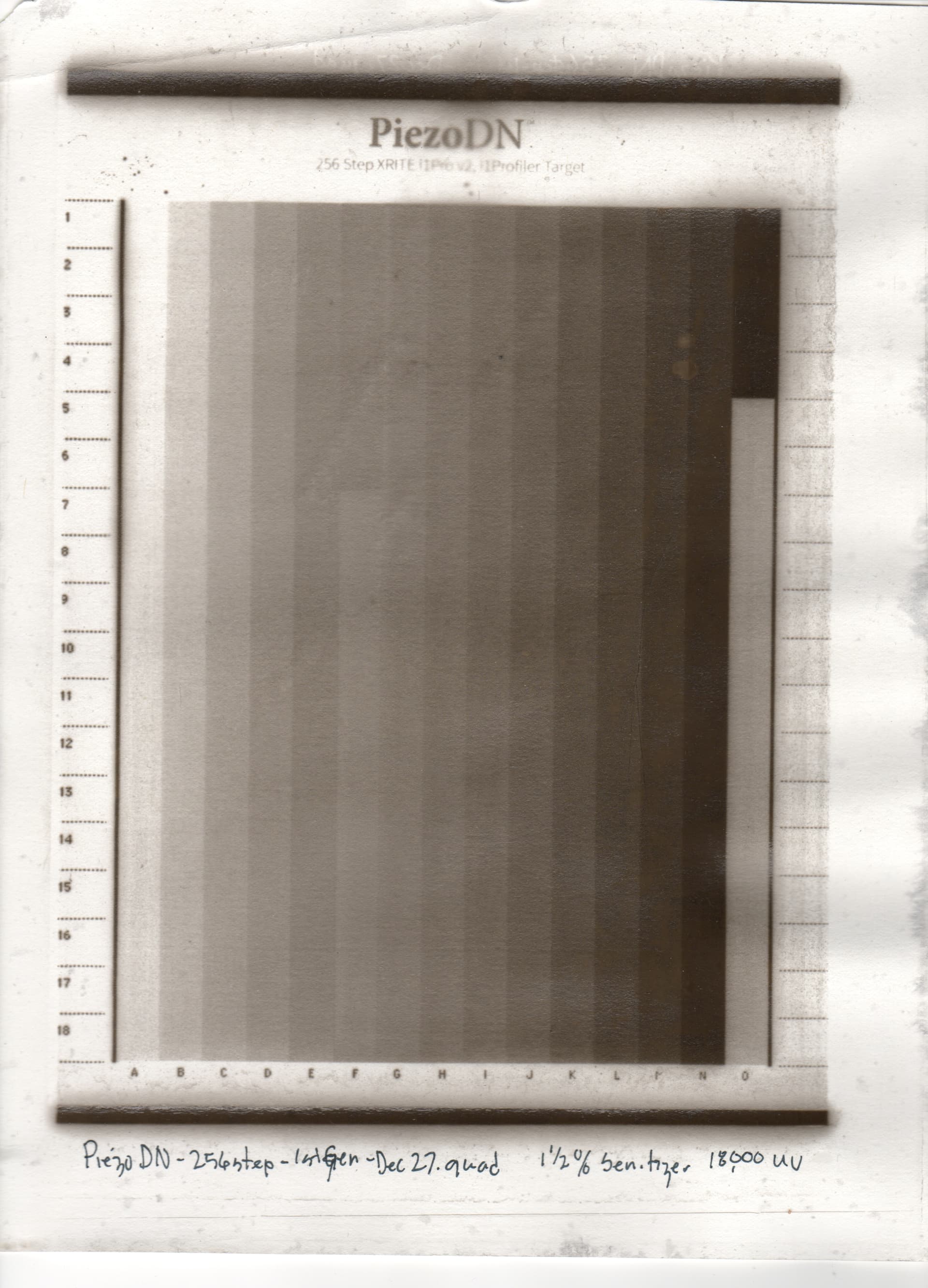
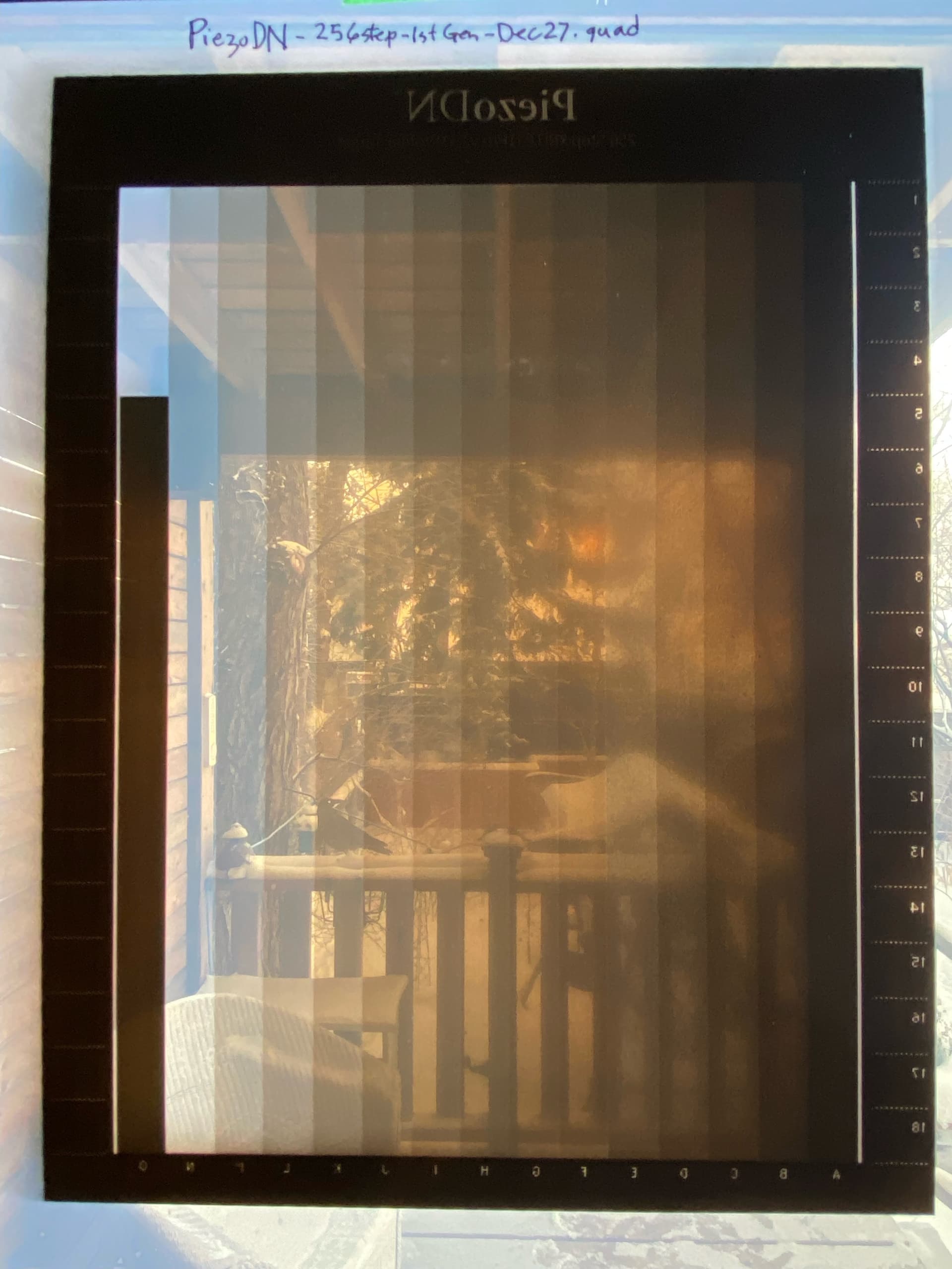
I printed a 256 step greyscale target using the PiezoDN Master quad. I then read the print with the i1Pro2 and created another 1st generation adjustment quad. In making this quad i had a lot of reversals in the Professional spreedsheet so I adjusted the first (hightlights) a bit so I had no reversals and left the rest along. I had to apply a lot of smoothing (90/70). I then used this quad to make another negative and carbon print. I also seem to getting some overspray of ink around the periphery and dark areas of the negative. Any remedy?
Attached are the Master Quad Print, the new adjustment quad, and the adjustment quad print. I have also attached a photo of the adjustment quad print.
PiezoDN-256step-1stGen-Dec27.quad (7.6 KB)
I re-read your email just now and found the 16-21 step target you and Walker wrote about. I had a lot of jaggies in my Master Quad print analysis so I am going to try the 16-21 step target to see if I can get soother transitions. I was looking in the PiezoDN directory so didn’t find it until I re-read your note. Thanks!
In the meantime any comments?
jjp
I further question, the 12-21 Target in Piezography image directory is a positive image. Do I print it as a positive image and used the associated i1Pro2 to analysis this from the print? When I take the LAB values into the the Piezography Professional spreadsheet do I have to reverse the numbers?
OR
Do I print the target by turning it into a negative and then using the i1Pro2 to read the target print in the normal manner?
Hi Keith,
I tried printing the 256 step target with the PiezoDN-Master quad and the i1Pro2 analysis showed quite jaggy steps which required a lot of smoothing in the Pro spreadsheet. My first derivative quad was better, but still had shade transition problems. So I want to try the 21x16 step target. I found it in the Piezography image folder, as you said, but it is a positive target, not a negative DN target.
Do I invert this image before printing it on the Pictorico film, and can I use the i1Pro2 data file for this target which is found in the same folder? Please clarify as I am confused. Jjp
Jjp
Hi John,
You can use the target as is – no need to do a tonal inversion or anything like that. In fact the only difference between the targets for regular Piezo inkjet printing and those for PiezoDN negatives is that the latter have been flipped horizontally as evidenced by the reversed text. It is the quad that makes it into a negative when printed on film.
Personally, I use right-reading target images because I have customized my targets somewhat with a 21-step strip and some space for pre-printed text that I have found to be indispensible for organization when doing lots of testing. You can select Flip horizontally in the layout section of the print dialog and save that as part of a preset along with the QTR setup if you want.
I’ve never used more than 129-steps for digital negatives. The higher step counts are certainly useful for inkjet on paper, but may be more trouble that it’s worth for alt-process printing where the hand-coating and other darkroom variables can quickly compound minor fluctuations into major (and misleading) jaggies. If I was starting over on this Carbon project with my friend, or working out something for a process myself that we don’t have a useful starting quad for, I think I’d start with a 21- or 31-step target to find the ballpark, then move to a 129-step for fine tuning once the basic parameters were established.
I’m afraid I’m not fluent in i1 Profiler. I’ve been using SpyderPrint for a long time and am very comfortable with that, and I can use any of the targets with it. I had a student a few years ago who was very good at i1 Profiler and he spent an hour one day trying to teach it to me, but it didn’t stick. I still use ColorPort occasionally. I’m guessing that the associated .pwxf file is useful for sorting the patch readings, but I really don’t know. Hopefully Walker can throw some light on that question.
Hope that answers your questions.
Good luck and happy new year,
Keith
Greeting Keith and Happy New!
I have made some prints of the 20x16 target and have had some difficulties with my i1Pro2 reading the values. I may have to resort to reading one patch at a time.
However, I may have another problem with my printer, an issue of overspray. I have done head cleanings, head alignments and setting paper thickness but I still seem to have the problem. I have attached two photos to illustrate my problem. One shows most of the negative with the overspray occurring on the trailing edge of the printed negative. The second photo show a detail of one of the clear patches which shows some overspray at the edge of a clear patch and a dark patch.
Do you have any idea of what the problem is and how to solve it?
jjp
Are you using front feed method? That can cause overspray. I suggest top feed method with the work-around for the star wheels.
-Walker
Yes I was. I will your suggestion a try.
Jjp
Thank You Walker!!
I found Keith’s pizza wheel suspension work-around description and followed his instructions. I managed to deactivate the pizza wheels, left the front load bay open and printed from the rear manual feed. What a difference! I produced a nice clean sharp negative and will restart my linearization process with a 20-16 print from the Master Quad. I did notice that the negative becomes skewed during the last 1 1/2 inch of the negative printing, but I can always leave a 1 1/2 inch margin on the negative. The alternative, which I used in producing salt print negatives, was to use a mylar carrier and taping the negative to it with a wide margin at the leading edge.
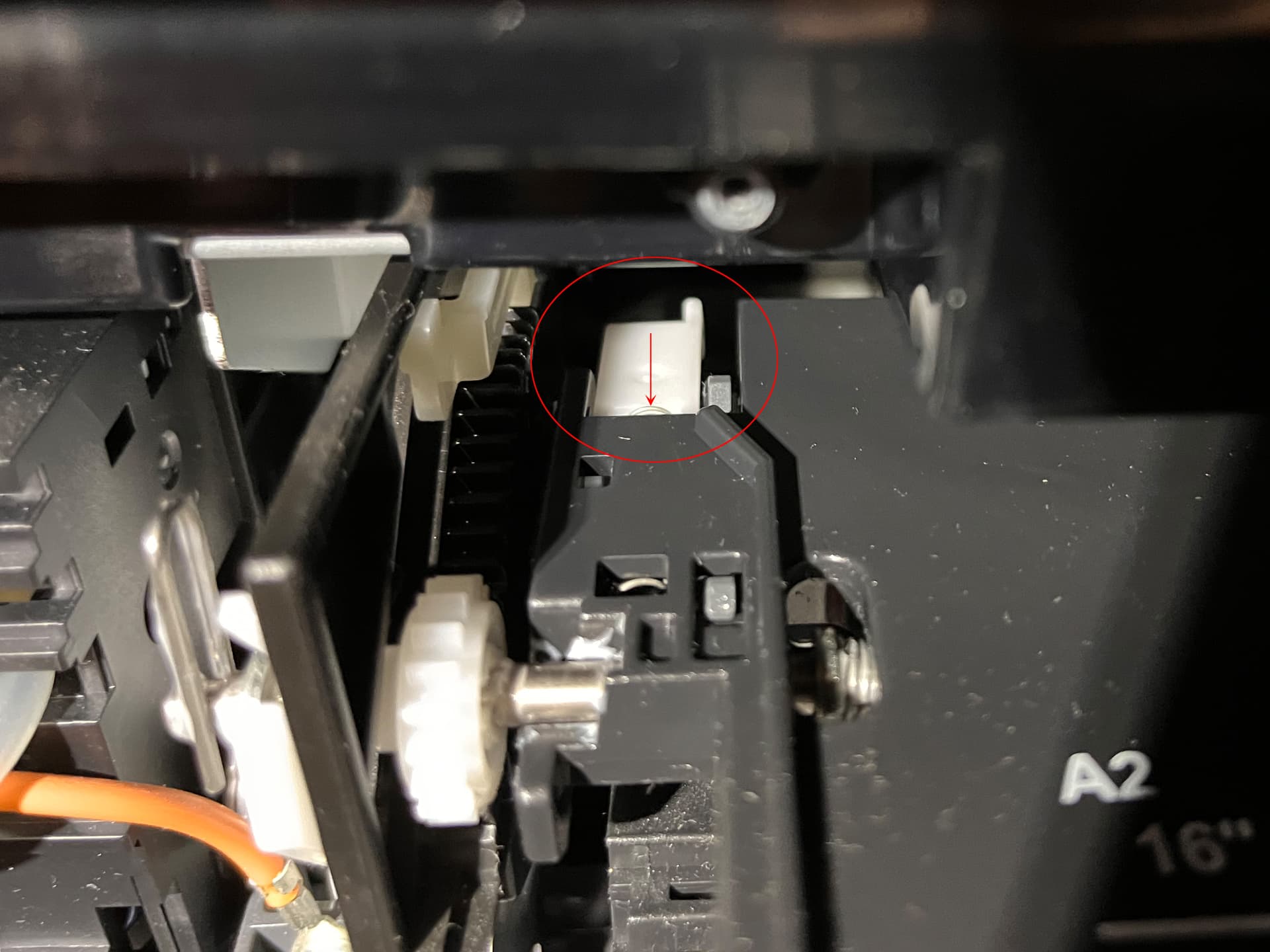
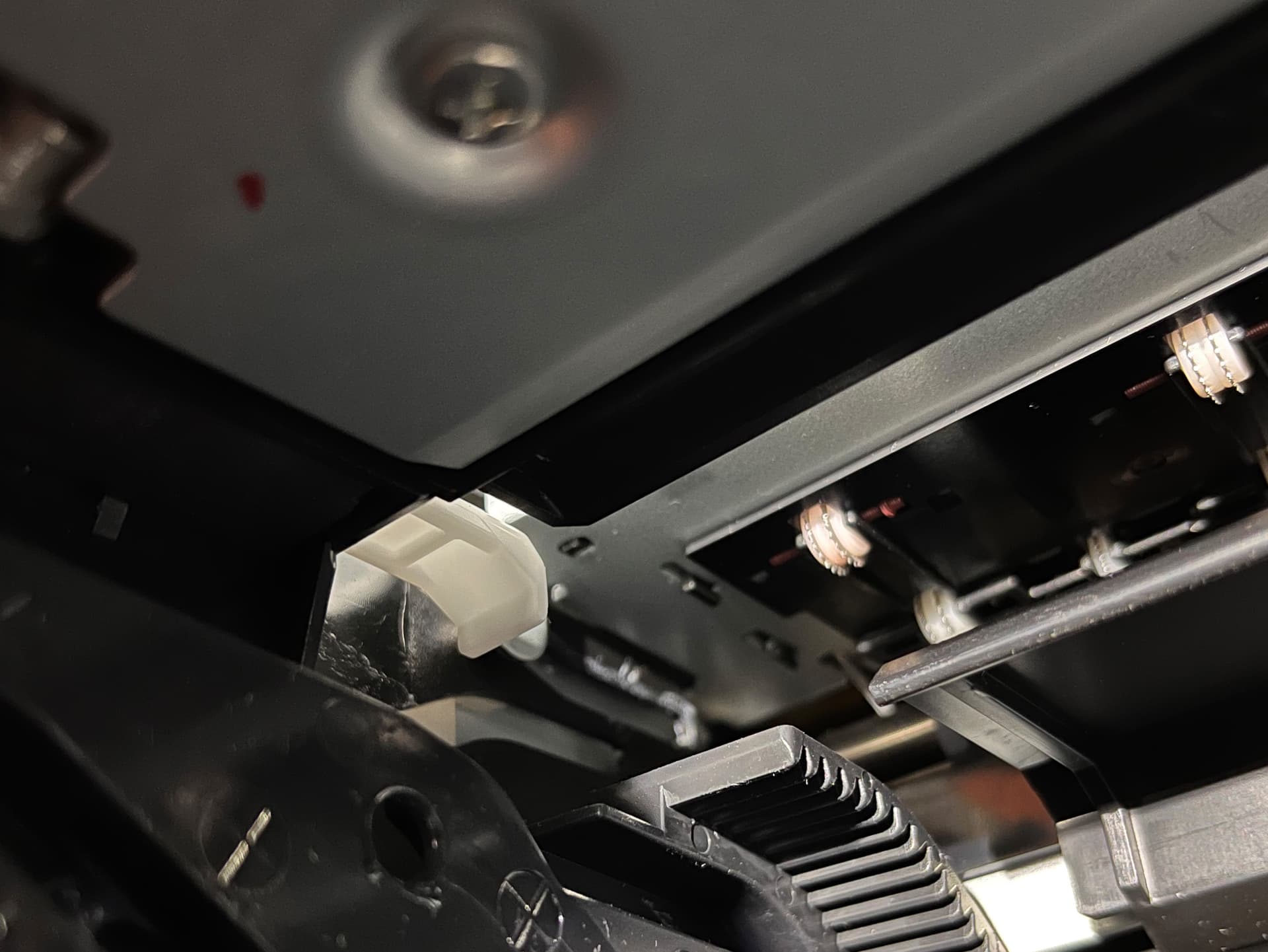
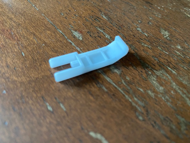
However, when I made the pizza wheel leaf adjustment on the left side of the 3880, I accidental dislodged a little plastic part and am not sure where or how to put it back in place. the pizza wheel bar seems to sit at a skewed angel so I think it may have to do with keeping the lefts side of the pizza wheel bar in place. I have attached a picture of the part. Perhaps you or Keith could advise me on how to get it back in place. It may have been attached to a small spring.
Hi John,
The trailing margin issue that you stumbled upon is well-documented in these forums, but it’s easy to miss until it happens to you. My initial work-around for target printing was to use 8.5 x 12 or 13" sheets cut from a 17" roll that I happened to have. After that ran out I usually cut them from 13x19 sheets. A little bit of waste but not enough to fret over.
I found that little piece that you dislodged and indeed it does have a spring as you can barely see it at the near edge of the piece in the first picture below. Hope you can find it. As far as I am aware, you are the first to have dislodged it! I’m not sure how to get it back in but it may involve removing the upper case. Maybe Walker knows about this.
My friend’s latest tests finally arrived yesterday. At my request he also printed a few Stouffer 21-steps which do not show quite what I expected. It will be interesting to measure and plot these results and see if I can reconcile the PiezoDN negs with the Stouffers. I think I’ll need the weekend to get through it all. He has also switched to printing on Yupo.
Keith
Hi Keith, thanks for the pictures, they help me identify the correct position of the plastic piece. Now I have to figure out how to get it in place. I think it holds the left side of the pizza roller bar in place.
Regarding the trailing margin, when I worked with salt print negatives using my 3800 and the Epson inks, I taped my Inkpress negative material to a Yupo carrier just along the leading edge of the negative, allowing for a wide margin. I was using the front paper feed. I had to tape carefully to avoid head strikes near the leading edge. Using the front loader on the Epson 3800 I did not notice the overspray problem around the edges of the negative. Don’t know why there was a difference.
I did make a print with the new negative, but have yet to analyze the results with the i1PRO2. I was going to print the Stauffer scale with the negative, but seem to have lost track of where I put it. It is a good to compare it to the actual negative on the same print. Good luck with your efforts.