Hey Walker,
Do you know of a Carbon printing DN curve For Epson P600-800?
Thanks,
Forrest
Hey Walker,
Do you know of a Carbon printing DN curve For Epson P600-800?
Thanks,
Forrest
yeah, there’s a few people on this list who have done that. Although I think they did with a special dye ink beta testing set I made which never ended up commercial. But they can chime in
best,
Walker
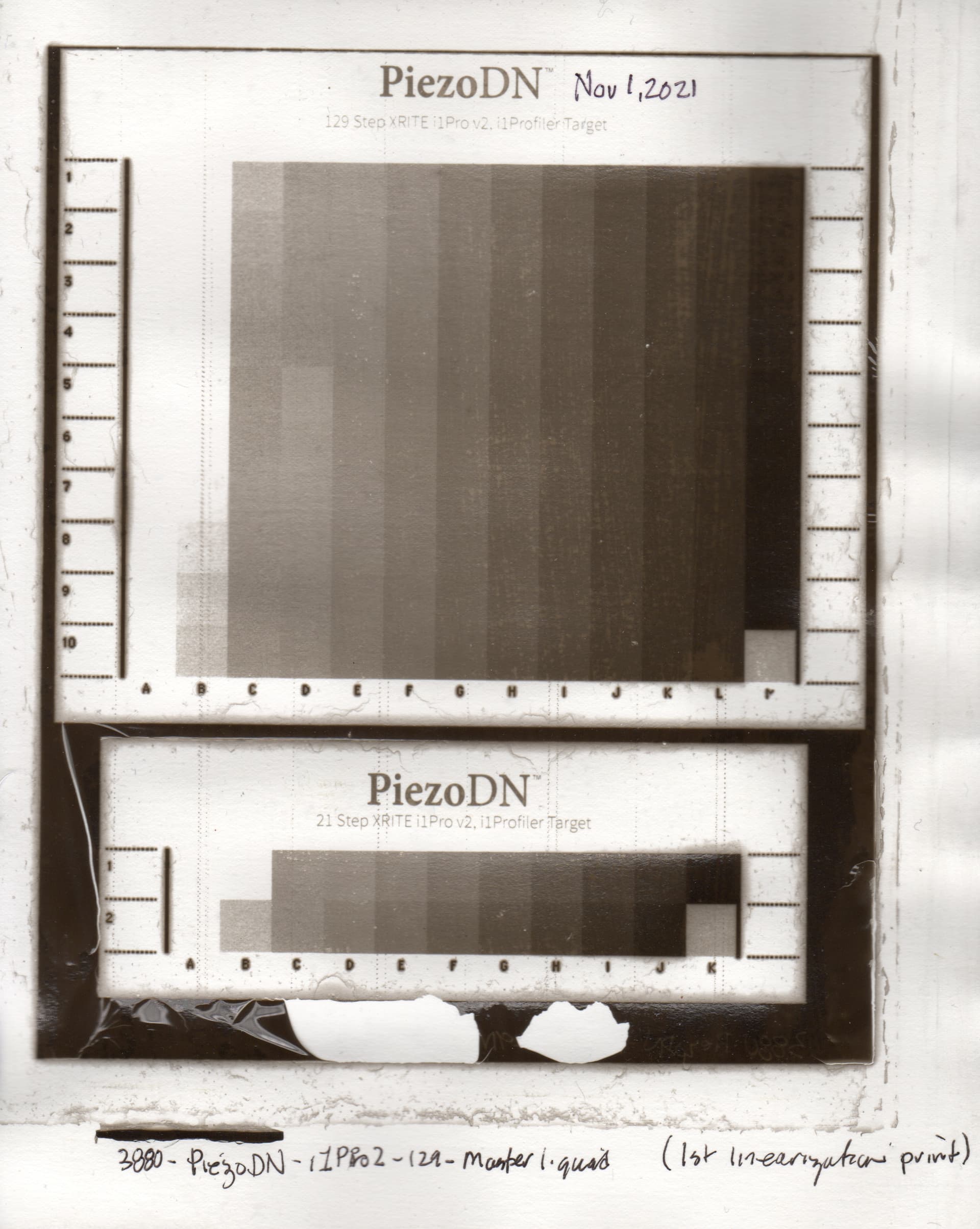
I used an ICC file to linearize a K7 Carbon quad file i used with my Epson 3880. I was having problems linearizing the highlight and the shadow areas and my midtones were shifted to the shadow area.
I made a print with my best linearized quad file and loaded it into Photoshop along with the original 129 step greyscale. I produced an adjustment curve so that my print was as close to the original greyscale as possible. Using only 4 data points, there is an automatic smoothing in effect. The input and output data point values were entered into the Piezogrpahy-Curvs-Adjustment.xlsb and the resulting LAB values in the CGATS page were copied and pasted into a text editor and saved as a text tile. This text file and the quad file were dropped into the QTR-Linearize-Quad.app droplet. This resulted in a new linearized quad. That quad is attached.
Quad-Nov25-curve1.quad (7.6 KB)
John P
Something is very off with the curve.
best regards,
Walker
Hi Walker,
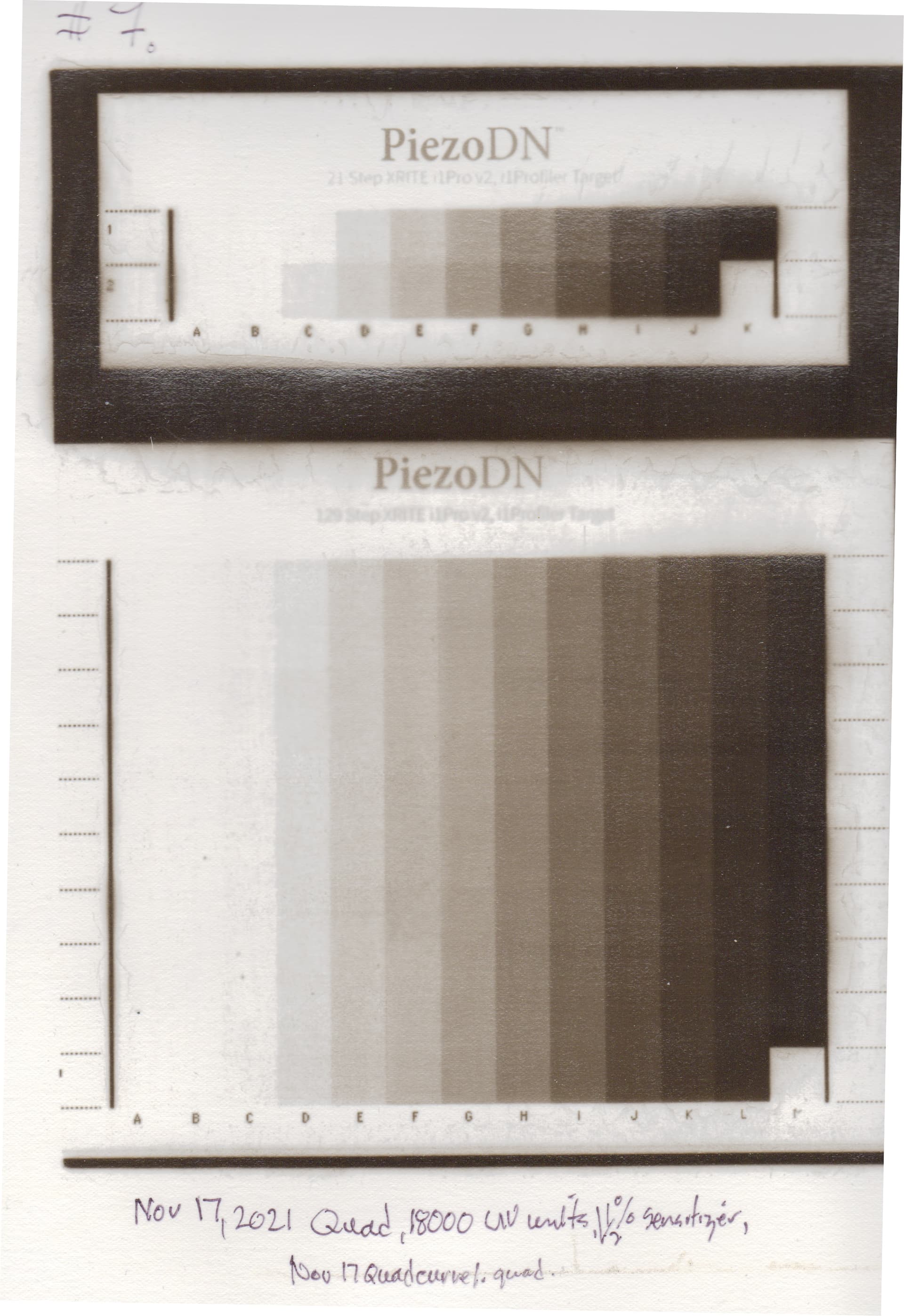
I know the quad generations look odd, but I think I have been following the video guideline and instructions with PiezoDn Professional so I don’t know what is happening. I am using the K7 Carbon Piezo inks with the printer set to use Photo Black loaded with High Density Photo Black (PZPRO-DHPK).
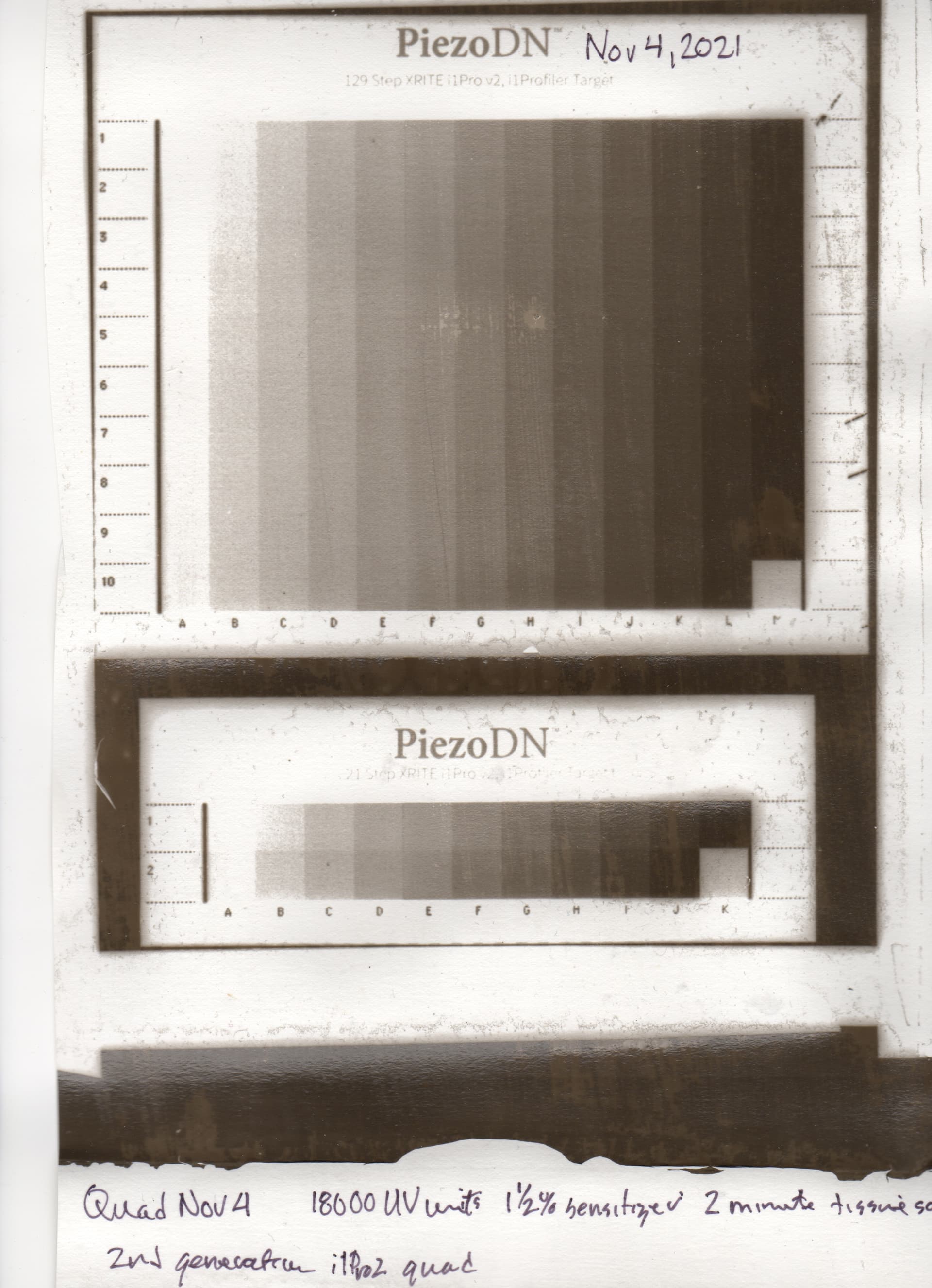
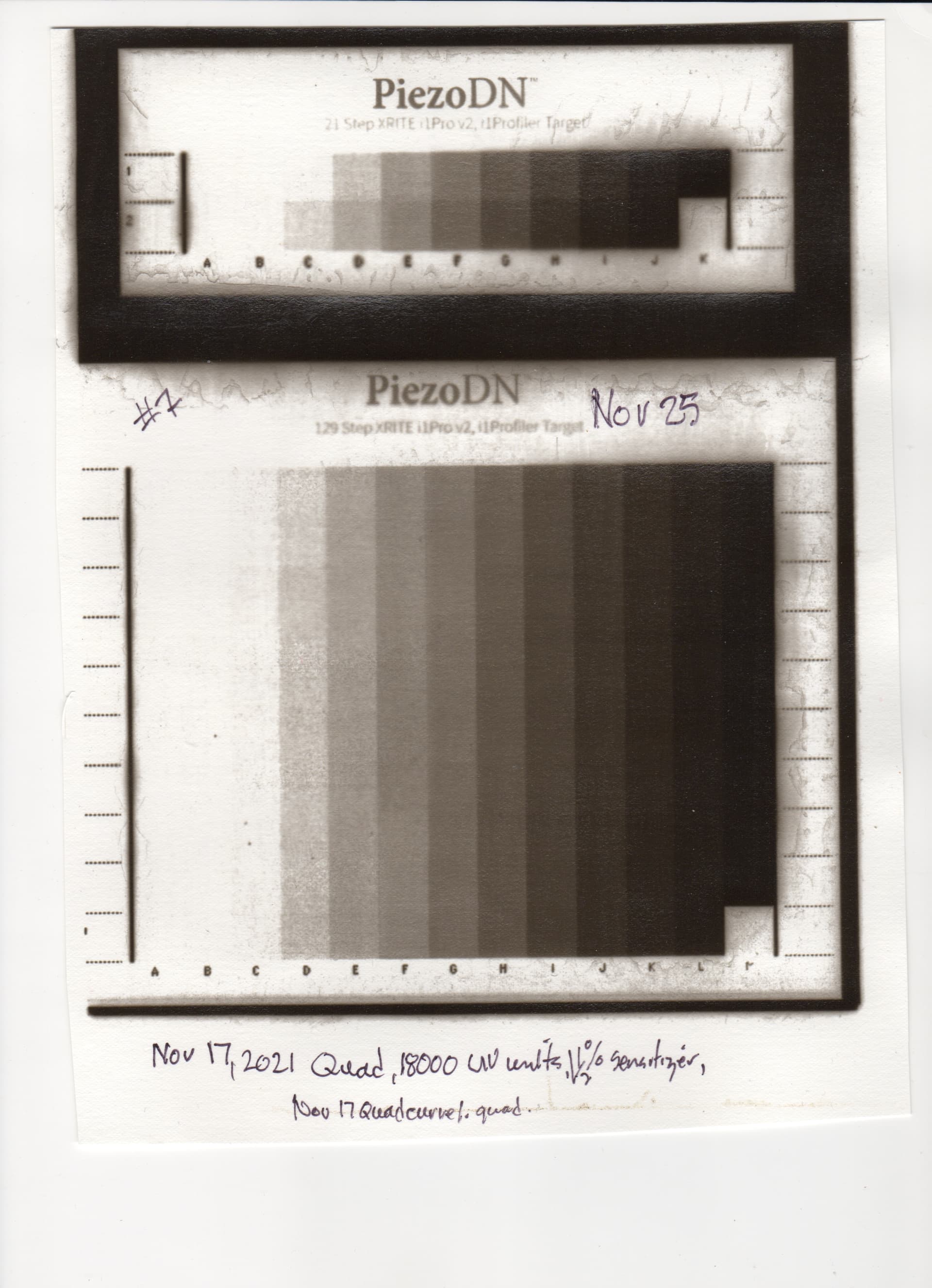
I have been using the PiezoDN-129step-i1Pro2.tif as my linearization image. I started with the 3880-PiezoDN-Master.quad. I printed the negative using a 1 1/2 % Ammonium Dichromate sensitizer with isopropyl alcohol with a 15 gm Speedball ink and a mil layer of glop on Fabriano Artistico hotpress paper sized with 2 coats of 50% dilute Golden Matt Medium. Because this sizing does not absorb much water, I had to increase my tissue soak time to 2 minutes in cold water. My tissue, sensitizer, paper sizing, exposure time and developing time are standardized.
I started with the 3880-PiezoDN-Master.quad and made a print as shown below.
I read this print with my i1Pro2 and made my first adjusted quad:
PiezoDN-Nov4.quad (10.6 KB)
I made another print with this quad.
As you can see there are flaws in my carbon print but it is the closest I have come to capturing the tonal range.
Perhaps you could explain what you meant in your No 2 comment “Do a manual curve tune to get it roughly in shape (aka, printing highlights and shadows enough to calibrate” as I am not sure what you meant or the procedure other than the normal linearization method.
Any further advice you could give me after looking at the attachments would be greatly appreciated.
John P
ok, so something is off because you have reversals in the master curve print and you have blown highlights.
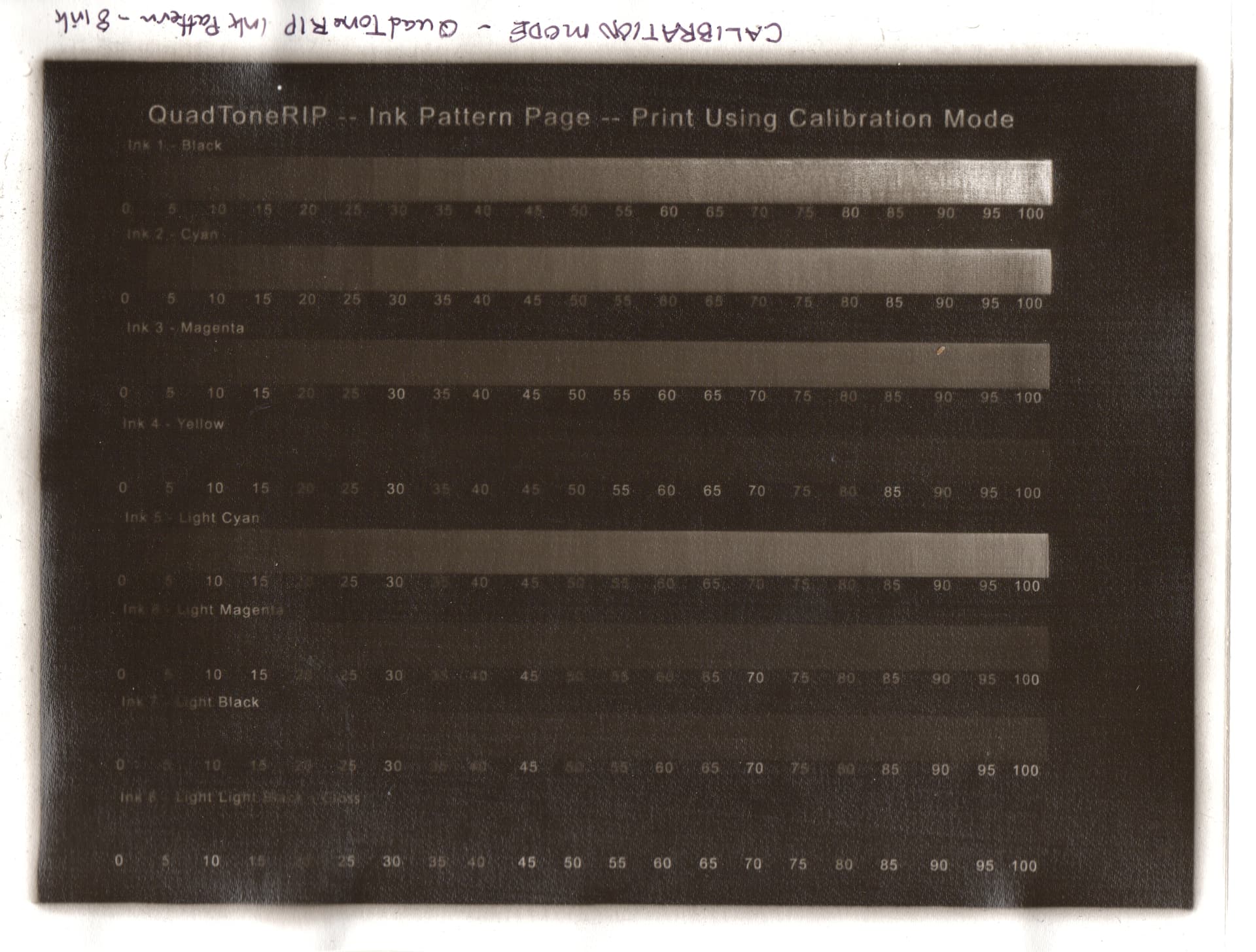
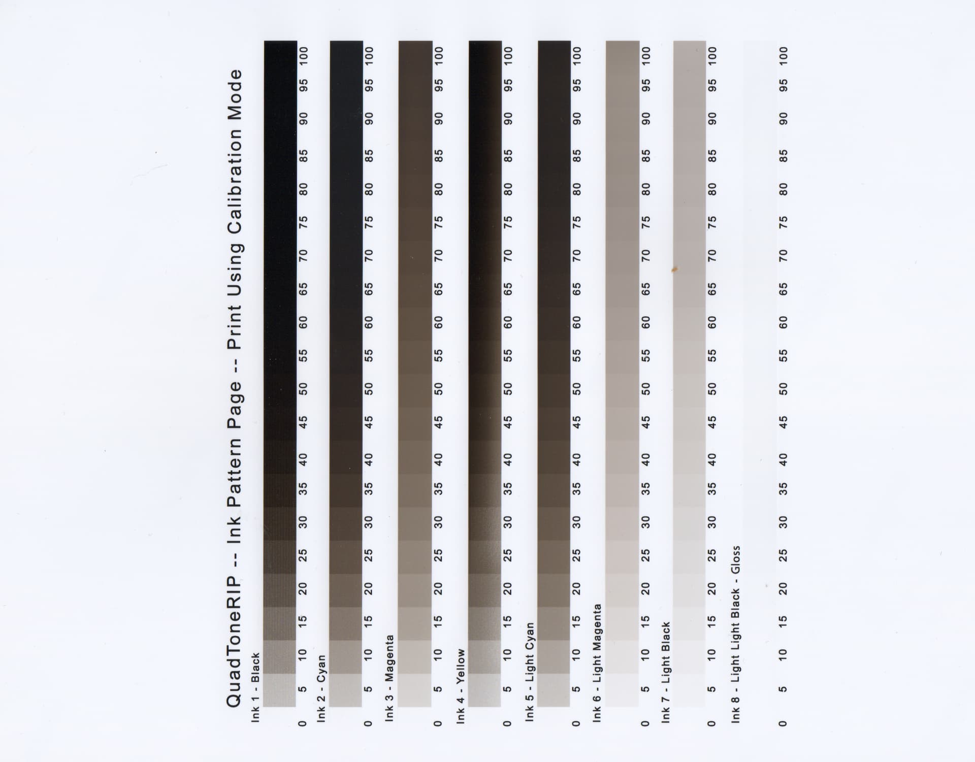
So you need to print out this target in “calibration mode” from quadtonerip and verify that all your inks are in the right channels.
VPI-10InkSep.tif.zip (674.1 KB)
Then after verifying that you need to modify this target a lot but manually with a curve in PPEv2. You need to lower the highlights and lighten everything else just so you can calibrate.
-Walker
Hi Walker,
Thank you for your quick response.
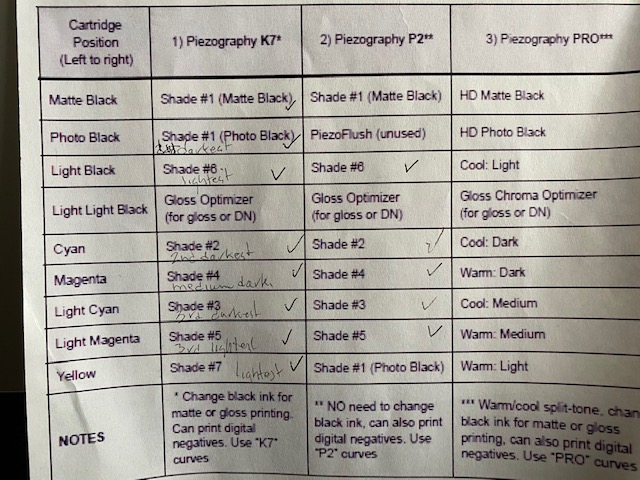
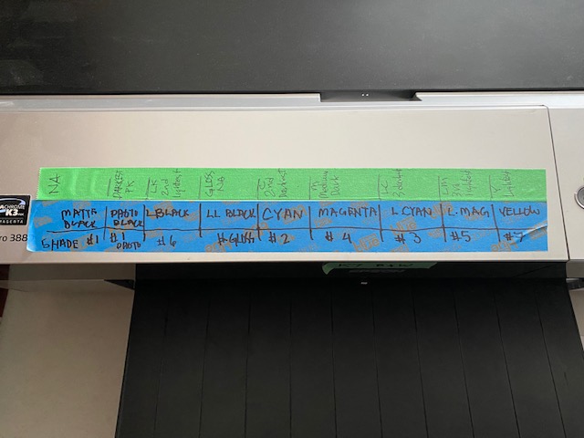
Before pursuing the avenue you recommended, I would like to confirm that I have placed my inks correctly. I have installed the inks as shown in the 1)Piezography K7 column in the attached photo. I print with PrintTool with the color management turned off. I print at 2800 DPI and use the Ultra HD Photo Black in the PhotoBlack position on the Epson 3880.
As you will note from my nozzle check, the heads often clog when the printer is not used for a few days. Is there a way to reduce this by say putting a plastic bag around the printer? I do unclog them before i print my negatives on Pictorico Ultra Premium.
I noticed that the second darkest ink (vivid Magenta slot) is the one with the weirdest quad chart line so I was wandering if the ink positions are correct. I am using the PPE spreadsheet to linearize my quads.
Comments re the ink positions?
John
Please do as I ask but make sure you have clean nozzles first. I can’t help you otherwise.
Looking at a 90 deg tilted, blotchy low res nozzle check is not = to print the VPI target I attached above. I can help you when you print out the target verifying you inks that are actually there in the channels.
-Walker
I will print an ink separation negative. My printer has nine ink positions but only uses 8 at a time, either Matt black or Photo Black. I found the 8 ink calibration target in QuadTone RIP files and will print it out. Jjp
You can also just print the 10ink one I sent in this thread. It prints only 8 when there is an only-8 printer.
either way works
-Walker
Thanks. Good to know. Jjp
Greetings,
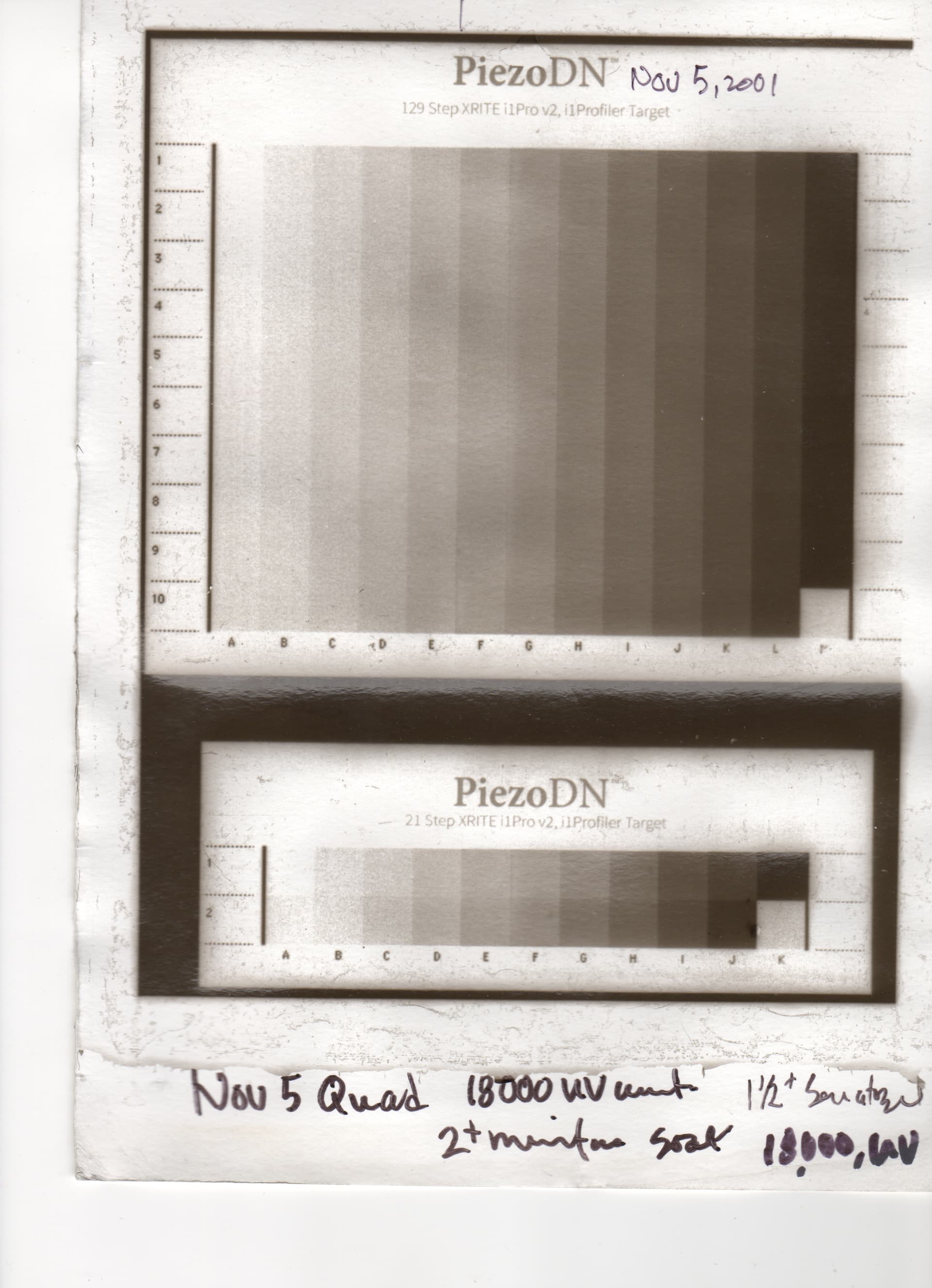
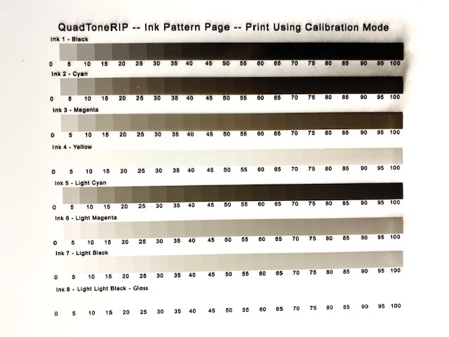
I unclogged my printer head on the 3880 and printed the 8 ink separation image using the QuadToneRIP calibration mode. I printed one on glossy photo paper and one one Pictorico OHP Ultra. I also made a carbon print from the Pictorico negative using my standard 18,000 UV units and a 1 1/2 % solution of Ammonium Dichromate at the recommended amount per square inch. I have attached a copies of the 3 images. The carbon print seems to indicate that the printer is not applying enough ink or am I misinterpreting the result. Your feedback would be much appreciated.
Greeting,
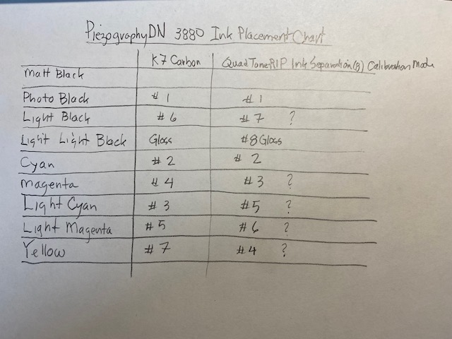
I noticed that the ink placement for K7 Carbon Inks for the Epson 3880 is different that what seems to be the case in the 8 ink QuadToneRIP ink separation chart. Is this a problem? Attached is a chart which shows the different ink placement.
Hi John,
The ink positions in the K7 Carbon column of your handwritten chart are correct. Don’t let the Ink #s on the QTR Calibration target confuse you – they do not refer to Piezo ink shades. (I think they are used in QTR generated profiles which we do not use with Piezography.) Use the color channel labels to correlate with Piezo ink shades.
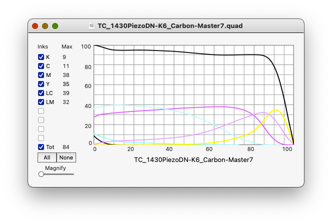
I don’t do carbon transfer myself, but I have been working with a friend who is learning it. He is using my old 1430 with K6 Carbon inks, and I am making profiles for him since that part is beyond his computer skills. It has been quite a challenge. We have been through 7 iterations so far and are finally getting close to something useful. This is partly due to the fact that he is new to the process, though he is a very skilled darkroom printer in several other processes, and partly due to my surprise at how short-scale the process is and having to do quite a bit of manual work to the individual channel curves. He told me just yesterday that v7 of the curve is looking very close and even better since he cut down on the dichromate a bit. I should be receiving the test samples for reading and further adjustment next week sometime.
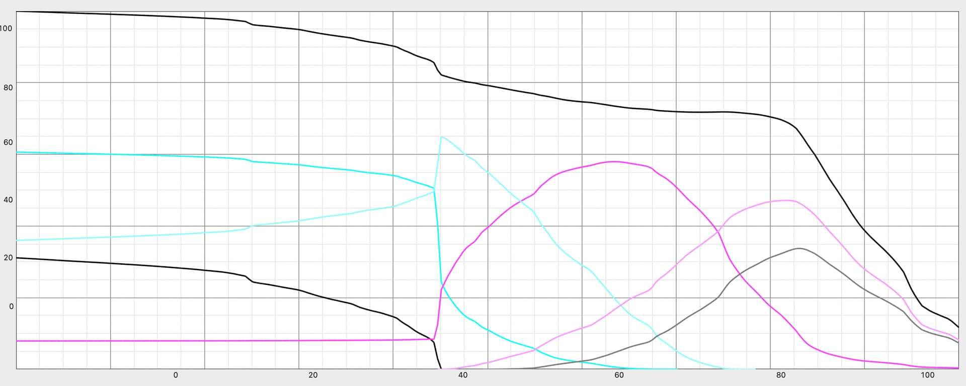
One thing I can tell you now is that ink levels for the darkest inks had to be cut way down. Curve view of the last iteration looks like this:
Cheers,
Keith
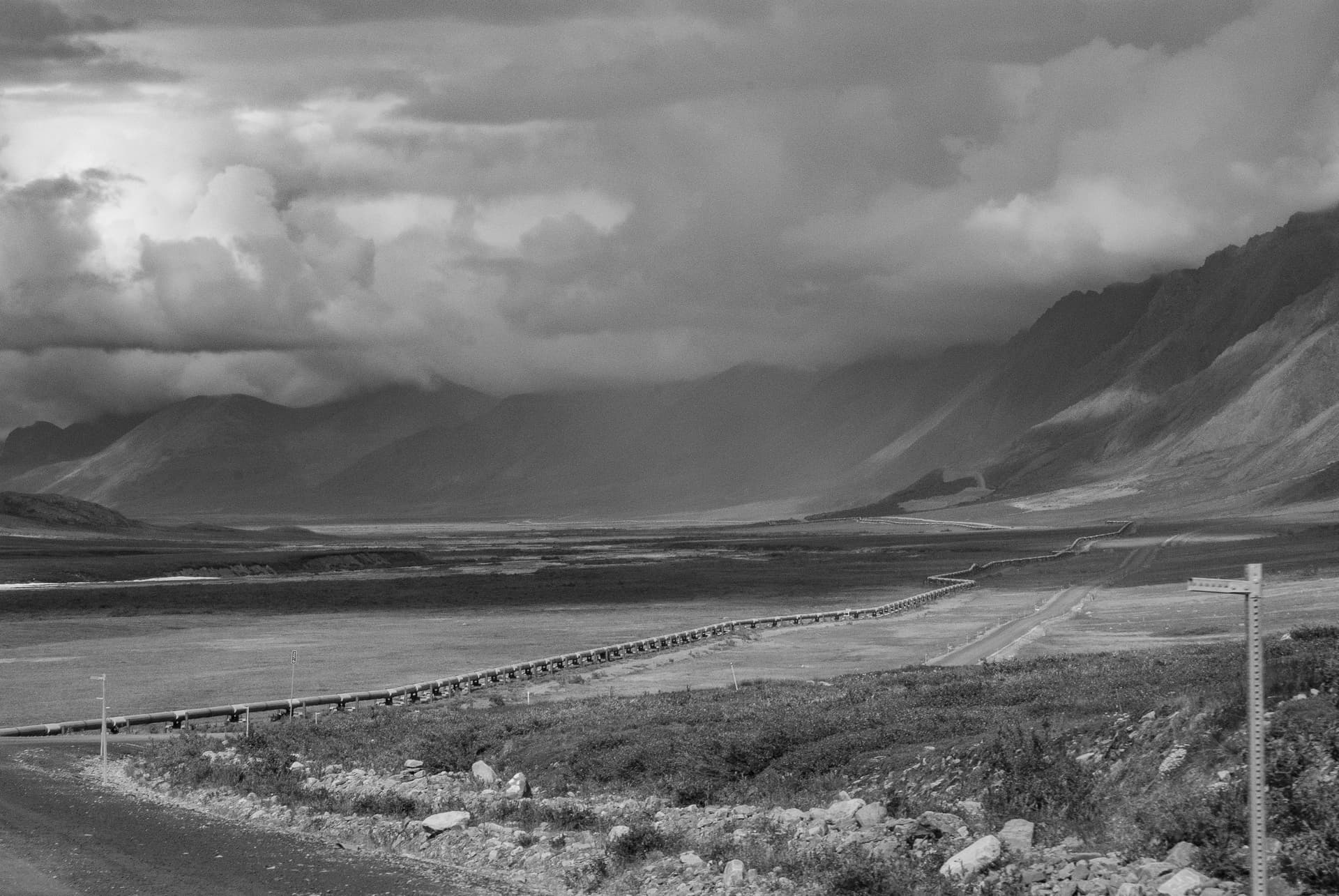
PS – Atigun Pass, north side I think. I was there in '98. https://jkschreiber.wordpress.com/portfolios/wider-view-segmented/#jp-carousel-674
PPS – I remember a John Penner from college at the University of Arizona in the early '80s.
Hi Keith, I have been trying to develop a K7 Carbon quad for my carbon printing process for months and have gone down the sequential quad fine-tuning path a number of times with limited success. So if you could share a carbon quad file with me that would work or be a starting point for me (I started with the Master quad), that would be much appreciated.
On another note, I looked at your Alaska photos, and they are beautiful. Not sure how you produced them. If they are 4x5 contact prints fitted together, you must have had excellent camera control. I live in Saskatoon, Saskatchewan, Canada. I explored Alaska in 2012 and hope to produce a carbon print exhibition of photos I took in Alaska, the Yukon and the Northwest Territories.
Hi John,
Thanks for sharing those links – beautiful work. The Prairie Landscapes feels like reading Wallace Stegner to this old southwest desert boy. The White Yukon slide show reminds me of the 4 road trips to AK and YT (via BC and AB) and even into NWT on the last one in '98. But I’ve never been there in winter!
My work was on 8x10" film using a tripod fitted with leveling base and panning head instead of the usual pan/tilt head. Prints are palladium. I had to give up the big vacuum easel when I moved from Tucson to Taos in 2005 so all of the segmented panoramic prints were made before that. I’ve been trying to work with an old 7x17 banquet camera more recently, but that has been a bit of a nightmare.
About this Carbon Transfer quad: My friend actually got me involved to work out the digital negative side last January. He wasn’t yet quite settled on some of the darkroom aspects such as paper, pigments, dichromate level, &c., so there have been a few detours along the way but we are getting very close now. He started on Fabriano Artistico, tried a few other watercolor papers, and even Yupo, and has now settled on fixed out photo paper. I’m not sure about his pigment mix but I think he finally understands why I have been nagging him to choose something and stick with it at least until we get a quad good enough to call the Master. At his suggestion, on the last couple of iterations I lowered the Dmax way down to help reduce (or hopefully prevent) frilling, and it seems to have helped. Finally, on the current round of tests, he reduced the dichromate level (I can’t find his notes on that but will get the details asap) and says that it helped lessen or eliminate the grit he was getting in the last few steps to white.
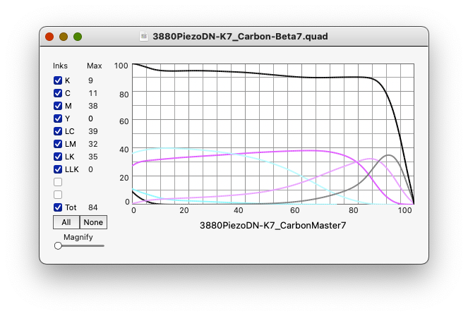
I can’t promise this will work for your system and working methods, but here it is and good luck:
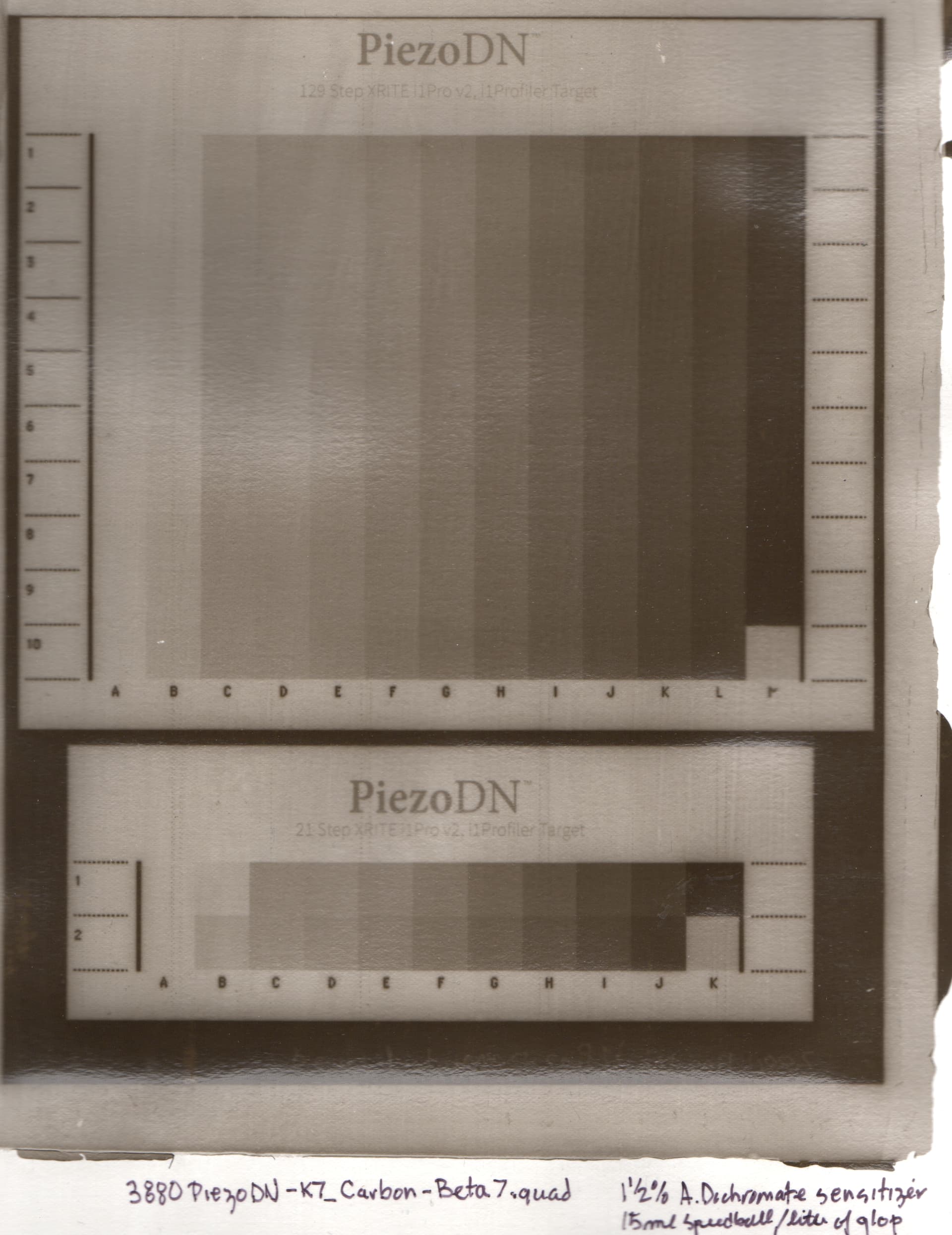
3880PiezoDN-K7_Carbon-Beta7.quad (7.7 KB)
[center][floatl][left]Note: I found a flaw in this curve that probably lowers Dmax slightly by applying a little ink (Shade 4 - Magenta channel) in the last step which should be clear uninked film. Here is a corrected version:
[/left][/floatl][/center]
3880PiezoDN-K7_Carbon-Beta7a.quad (7.7 KB)
And a screenshot of the QTR-CurveView:
Cheers,
Keith
Hi Keith,
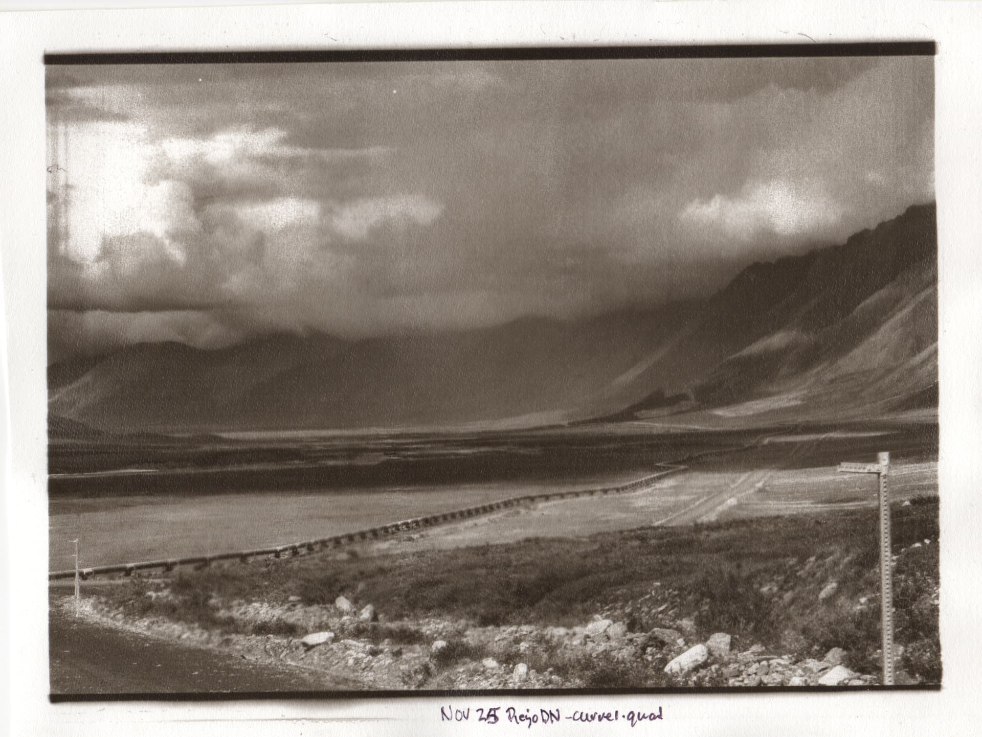
I tried the Quad file you sent me. The resulting negative looked flat and lacked density. I made a carbon print which verified my assessment of the negative. I have included a scan of the print for your reference. Thanks again for letting me test your quad file. Just to be clear, I have pretty much standardized my darkroom setup, and have been exposing at a regular 18000 UV exposure units at a 1 1/2 % Ammonium Dichromate concentration which should give me a good contrast. So I will go back to the PIezoDN Master quad and test with the 256 step scale and my i1Pro2.
Walker Blackwell suggested doing a manual adjustment of the quad curve so that the highlight and dark areas would both print. I am not sure what the process is for manual adjustment. If my contrast is too great, I can perhaps increase my sensitize concentration.
Years ago I took a carbon printing workshop with Luis Nadeau and used some of my 4 x 5 negatives. No problem there. I have built my own 8 x 10 camera, but have yet to test it out. On your web site you said that you used mostly film negatives, perhaps this is the way to go. Producing a linear quad file for carbon printing has been quite a challenge, but then I am not that well versed in digital print technology - a steep learning curve for a senior.
Thanks again, and perhaps we will meet some time.
jjp
You’re shadows look but highlights are dark. So I suggest printing the 21x16 step target and calibrating with Piezography Professional v2 software with the data from that color port target. It’s gonna help you a lot.
-Walker
Hi John,
Granted this needs to be linearized to your particular way of working, but I think it looks quite a bit better than what you posted back on 11/28 and 11/30. It’s hard to compare the picture of the latest test to your earlier ones because the lighting is very different, but it looks to me like you have a full range of tones where you did not before except for maybe the 11/5 example above.
Having said that, I took another close look at the quad I shared and found a flaw that I had somehow missed earlier. I think it is likely responsible for the slightly veiled shadows which appear to result in a lower Dmax. The lightest step in all channels (step 256 of each channel) should be zero in the quad, but in the Magenta (shade 4) channel it was 8. I have changed the last 2 values from 14 and 8 to 10 and 0. You can do this manually in your text editor or try this revised curve if you want.
3880PiezoDN-K7_Carbon-Beta7a.quad (7.7 KB)
Your earlier test are quite similar to where my friend and I started out on this journey. Extremely blown out highlights, becoming less blown out but still very gritty until the last couple of iterations. If smooth highlights are something you like I believe this is the right path. I suggest following through with this and linearizing it, then modify that to suit your taste if you want more contrast in the highlights.
Good luck whatever path you chose.
Keith
Thanks Keith. I will try Walkers suggestion first. I have printed a 256 step chart which seems to have a petty good gradation, and then use my i1Pro2 to analyze it and produce a new quad. It may be that the higher step chart (256 instead of 129) will give me less false readings. And thanks for pointing out that I can use the text editor to manipulate the input or output values. I think this is what Walker was suggesting to manually manipulate the highlight values and dark values until I could get both to print properly and then adjust the midtones through the normal linearization process. I will try the regular linearization process first and show you are he results.
Jjp