If you are only looking at K values you are misinterpreting the data because 8-bit K values in Ps are a percent scale from 0 to 100 showing only whole numbers. If you look at 8-bit RGB values instead you will see a change of 1 from each step to the next going from 255 (white) to 0 (black). I did just verify this.
Sorry I can’t really help with your specific spectro since I have no experience with either i1Pro 3 or i1Pro2, nor with Ventura. I do have an original i1Pro but have only used it with ColorPort. I much prefer my SpyderPrint which works just fine with Monterey on my MacPro trashcan.
Going back to the PPE graph screenshots you posted at the beginning of this topic, if I’m reading it right, you are showing the K7-SEL-UltraHDMK-MASTER.quad curve along with measurements produced from it. That’s not necessarily a bad first result on a paper that you haven’t profiled before. What happened when you used the new curve?
Here is what I see with just the master curve pasted in and no measurements:
It appears to be slightly different than yours based on what I can tell from comparing the relative left-right positions of the tall curve (shade 5 I think) in the middle. On mine it looks closer to center; on yours the gray one looks shifted slightly left and the black one shifted slightly right. (The gray is the starting curve, and the black is the corrected once measurements are entered.) That seems a little peculiar. The full path to the curve I used is Piezography > Curves > 3800-3880-K7 > K7-SEL-UltraHDMK-MASTER.quad. It’s probably just an optical illusion.
Maybe having a look at the PPE for each stage would help. And showing a scan or picture of your print made with the IJM master quad side-by-side with a print using the “linearized” quad derived from it might also be illuminating.
The really weird thing that I almost commented on earlier is that to my eyes in the scans of the prints you showed above I much prefer the tonal rendering of the 3880/K7 samples that you are describing as too light compared to the P6000, and in the original image the shadows just look like empty darkness. One thing that the print with your wacky profile reveals is that there actually is good stuff buried in those heavy shadows.
First, Keith, let me thank you for your time and courtesy pursuing this with me. Misery loves company!
I do agree that the image looks better with the curve I’m complaining about, but that’s the wrong criteria. What I need a print that matches my (carefully calibrated and profiled) monitor. The image IS very black, was the intent of the photographer, and his measurement match mine.
You can freely download the original image here:
I have already posted a side-by-side photo of the prints I made, in my post beginning “Here’s today’s results. I’ve attached an image.” above.
Finally, here are my measurements of columns 0 and N. They indicate some serious problems in the dark tones, with Column N missing over 50% of the tones it should have:
(The left most number is the value of the patch. There are 18 of them. Those with the question marks show the missing? next number. For example the reading goes from goes from 8 in row 14 to 6 in row 15. Where is 7?)
As you can see, in Column N , there are 10 values missing, which is to say it’s over 50% incorrect.
As the columns are lighter, the problems are not as bad. Column H, for example has 2 147 values (in rows 4 and 5)
So it appears to me that the Target is pretty seriously messed up if there are indeed supposed to be 256 different values.
A wonderfully apt description of this rabbit hole.
I think maybe I wasn’t quite clear about a couple of things. My first paragraph was only in regards to what you wrote in the post immediately preceding mine which I quote above. Since you referred to viewing it in Ps and to the K values, I assumed you meant the K values displayed in the info panel which is limited to whole number percent values. It cannot display 256 discreet values since it only goes from 0-100 rounded to the nearest whole number, hence only 7-8 values in each column. On the other hand, the RGB values can and do display all 256 values for the target. There is nothing wrong with the target file itself unless somehow yours has been corrupted. If you are talking about spectro readings of print values, that would be something else altogether.
Thanks for pointing me to the comparison that I missed, I think because the left one is labeled with the name of the quad it was printed with but the right one isn’t I didn’t recognize that it is exactly what I asked to see. Oops. But I can see that the new curve is clearly a step in the right direction. Have you done another iteration starting from that one?
I primarily make digital negatives to print in the darkroom with Pt/Pd and other so-called alternative processes. Because of the nature of these processes even the smallest inconsistency gets magnified and can easily throw off the linearization process. As such, it is normal to have to make 3 or more iterations before I am satisfied with a particular curve.
What you are doing here starting from the master curve for your printer and inkset to create a linearized curve for a new paper is not really so different from what I do, though you are unlikely to see any of the really wacky things that some of the more complicated darkroom processes can pull out of the hat. (I’m thinking of carbon transfer especially.) One thing that I have found very useful is to plot the results of each stage of my linearization process, from the first print with the master curve through however many iterations it takes to get to linear, on the same graph. Here is an example:
Green = Master
Yellow = 1st Lin
Blue = 2nd lin
Red = 1st Lin + ICC (derived from it)
I show this to you to suggest that you may actually be on the right track after all.
Three more questions:
What is M0 data? I know it’s part of the Profiler output, but is it LAB values or something else?
Are those numbers you posted above (columns N and O) K readings from Ps or something else?
Is there any chance the target file may have been tagged when you opened it in Ps? It should remain untagged.
That all said, I suggest the 21x16 i1Pro 3 target and workflow.
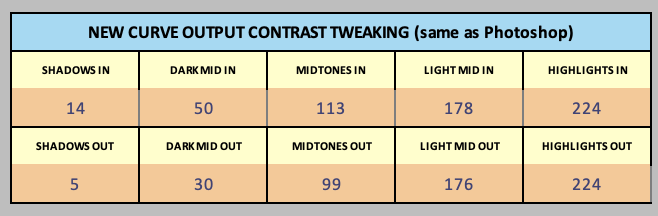
And set your contrast intent to the following for a perfect screen-to-print match (non-linear) that does not require any softproofing in Photoshop:
The “Calibrate and Validate” workflow.
Print the master.
Hair dry.
Measure and paste measurements + master curve into tool
Calibrate the master with the contrast tweak settings above.
Save new curve and install.
Print same target again.
Dry and measure this new target.
Paste the first calibrated curve (not master, but what you made out of it) into starting curve.
Paste new measurements into measurements.
Keep contrast intent same as above.
Make sure green line matches red line (ish). It should be close.
Go to New Curve sheet, copy and paste from that over the first calibrated curve (you have it open in Sublime Text already). This is an iterative calibration!
Save and re-install.
With this new final curve, print an image that is gray gamma 2.2 encoded and looks good on your screen without softproofing. Should match screen just fine if screen is around 1:200 contrast range, you have a white background around your image in photoshop, and you have a bit of light behind your monitor.
Walker: OK, that’s good news, but I’m curious obviously failing to understand: should not that 256 patch chart I"m using have a patch for every RGB grayscale value from 0 to 255? When I run the eyedropper Photoshop over the patches, that is certainly not what I get…
… and thank you for the new process. I’ll give it a go right away.
Thanks once again Keith. (And to Walker for his detailed reply using a different chart altogether).
To answer your questions.
M0 is simply “measurement one” and it is indeed the lab value, and is output from using the spectro.
The numbers in columns N and 0 are the RGB values as read in Photoshop’s info window, when rolling over each patch in the column. -IF- there are supposed to be 256 separate values in that chart, well, that’s not the case.
Yes, I’d suspect that at some point that chart got corrupted, but the one I’m using is straight out of the download, and shows up as “untagged”.
All that said, I’m going to give Walker’s plan a go right now!
MO is one of the ISO 13655-defined instrument measurement modes. Mostly a color measurement, thing. We are really just needing the L* value. The modes impact the A and B values.
I know that probably leaves the impression I’m a newbie. In fact, I was the first independent developer ever hired by Apple Computer, back in 1978. I’ve made my living programming and working with Apple products for 44 years, now, so “save as…” was the first thing I tried.
Cutting to the chase, with the Mac Studio and Ventura, you must disable SIP to properly install the Piezo software, or so it appears. Without doing that, the permissions belong to an unknown user, and thus prevent changes being made to the files and folders.
With my original install, instead of a simple permissions error, I started getting long, convoluted error messages when trying to save (something to do with the VB macros). [Sorry, we couldn’t find /var/folders/0f/5rq5k8ys76jd4n8080_y4d080000gp/T/com.microsoft.Excel/TemporaryItems/NSIRD_Excel_fxYEJx/E7688000.MACTF. Is it possible it was moved, renamed or deleted?]
So I reinstalled both editions, and it cleared up those issues, but because of the permission problems, I had to save as to my user documents folder.
I’m going to reboot; disable SIP; reinstall the Piezo files; enable SIP again, and see if that fixes the issues.
So you either have to change perms on the Piezography folder (not exactly secure all the time) or save to your user folder (I suggest Save As to User folder)
I loaded up the “Piezography-21x16step-i1Pro3.tif” in PrintTool, and printed it.
Went to i1Profiler, and clicked on the workflow “Piezography-21x16step-i1Pro3.pwxf”
It does not look remotely like the .tif image file. So I directly loaded the .pwxf from my desktop. Same thing
So, should I use that .pwxf generated image, and print it? Or is there some other .pwxf I should try?
Meanwhile, I’ll go disable SIP and try this whole thing over from scratch…
--------- LATER-----
Nope: I was wrong. Not a SIP issue. The main user/owner for Piezography is not correct, and unknown on my machine. A get-info shows “fetching…” for the owner. The user ID for the owner is recorded as “755” (whereas it is usually “501” or “502”.) Looks like a permissions code instead…
Here’s how to fix the “fetching…” issue, from my own blog. I just did it, and the “fetching…” issue is gone.
Unfortunately, there are apparently other issues preventing me from accessing the Piezography folder, and directly saving (aka “save as”) the spreadsheet to the tools folder.
I was able to save a copy to my own documents folder, and then drag it back to Tools, however.