Problem linearizing curves

I got several new papers a couple of weeks ago, and decided to create new Piezo curves for them, starting with some similar curves from other papers. When I posted the MO chart data into the spreadsheet used by PiezoPro, everything in the new curves chart was pushed significantly right (lighter) resulting in a significant “bow” in the linearity curve. I’ve attached a screenshot.

What’s new in this scenario is that I switched from the v2 generation of the XRite Spectrophotometer to the V3. (Or at least that’s all I can think of that’s changed.)

This of course results in prints that are significantly lighter, and lower contrast than I can use. I should not have to tweek my image curves to get a good print.

Is it hardware? Have I done some boneheaded thing wrong? My red line should be darned close to straight, from lower left to upper right. Instead I looks like Robin Hood stored his bow there.

Do I need to start over from scratch instead of trying to linearize my previous curves?

Advice greatly appreciated here!

That is strange. Have you tried repeating the calibration step using another 256 target? When I run into similar walls, my first step is to repeat the last step and see if I get the same results. Just a way to double-check that I have not introduced a human error into the system.

If you are getting the same results, I would ask, have you been using the printer regularly? Did you agitate the cartridges before the calibration process? What printer and ink are you using? I have seen print density fall off with ink that has settled and a printer that had not been used in a while. This was even after seeing a clean nozzle check.

Just some thoughts.

Most kind of you to reply. Thanks.
Certainly not an under-use issue, nor is it settled inks.

I’m using a 3880 with the selenium inkset (which I’ve used for about a decade now.) While at first I wasn’t taken by your suggestion of human error, since I’ve made maybe 100-200 profiles/curves over my time, but thinking more about it, I did indeed make a mistake, once, in I 1976 I think it was… :wink:

So, tonight I’m starting from scratch, using the K7-SEL-UltraHDMK-MASTER.quad to print my target again.

Got to let it dry overnight, of course, but then I’ll give it a go, and see if it’s better after one linearization pass.

(As a sanity check, I ran my test image through my K3 QTR (Richard Boutwell) on the P6000, and the image contrast and density was fine.)

I expect that you are right, and a fresh start is what’s needed (although that’s exactly what I was trying to avoid in posting here, of course.)

Happy Holidays.

1 Like

Good luck. With the repeat step. Waiting for the print to cure before measuring is the worst part!

Report back what you find. I’m really curious.

Thank you. I’m in the midst of it just now.

Sanity check?

I’ve been running a channel-swapped 3880 with Selenium Piezo ink using the Ultra HD Matte black. (I only ever print on matte paper with it, so there is no GO and the PK cart is filled with Piezoflush.)

On this machine, the Magenta channel is clogged. To deal with this, I opened the K7-SEL-UltraHDMK-MASTER.quad file in a text editor and swapped the data between #M and #LLK. NO other changes were made to that file, just the data swap. (In the printer, the slot 6 Magenta cart now has Piezoflush in it, while the slot 4 LLK has selenium ink 4 in it.)

To make a new paper curve, I selected the 256 swatch target Piezography-256step-i1Pro3.tif, and printed it via PrintTool using the newly modified K7-SEL-UltraHDMK-MASTER.quad file, above.

NOW… to create a new curve for a new paper, I dry the print for 36 hours and measure it, saving out the M0 data.

Now I open the Piezography Professional 2.2.2.xlsb spreadsheet, and load the new K7-SEL-UltraHDMK-MASTER into Starting Curve.

I tried the instructions under New Curve Channel Remapping to set the #M curve to NULL and the #LLK curve to #M, but that just copies all zeros from the now NULL #M into the# LLK. Obviously LLK cannot be 256 zeros, so I left everything as the defaults under New Curve Channel Remapping.

Finally, I load the MO measurements into the Measurements tab, and proceed with corrections and smoothing, and last, save out the linearized paper curve.

Sanity check: did I do everything right? Forget anything? Is the order of my steps correct? Set up remapping correctly?

I’m trying to figure out why my curves are all shifted to the right, and the resulting .quad file prints too light.

OK: days into this now, and it’s still weird on me.

I’m now thinking I’ve somehow put the wrong ink into one of the carts.

Here’s what I did since we last met:

I made a test print from the Master Curve file K7-SEL-UltraHDMK-MASTER. The dark tones are too light.
Any and all curves made from target printed with that master are also too light.
So I took several “canned” curves, provided with the Piezography software, (such as K7-SEL-UHD-MoabEntrada and K7-SEL-UHD-EpColdPress) and remapped them, and then made a print with those.
Still too light.

To show what I’m seeing, I laid out a print created with my P6000 (K3 inks) and one made with my errant 3880 (Piezo inks) and took a photo of them next to each other. Then I loaded that into Photoshop and took a screenshot of that image against a background of the actual image. IN the attached image, (1 - on the right) is the original image in PS; (2) is a photo of the print from my K3 machine, and (3) is the problematic print from the 3880 Piezo machine.

The shadows in the cliff overhanging the building are in the 94-98 K range (as verfied by the photographer and my direct measurement) while in the Piezo print they are in the 75-85 K range.

So, no matter what curve I choose, (and of course there are subtle differences) they are ALL way too light in the shadows, as if the UDMK ink (or next darkest shade [2?]) is not being added.

Assuming that the IJM curves are correct, and that doing a swap should not affect this, then all that’s left is that one of my ink carts got filled with the wrong ink.

The printed targets all look like a smooth ramp. The head checks (single and automated) are just fine.

If I must, I’ll throw out all my inks and start over with an init-fill, but boy I’d prefer that to be an act of last resort!

It’s worth testing with a different target . . . it could be a corruption or bug in the target . . .

plz zip and post the target here . . .

Target posted. (Thanks, Walker.)

Valleau-Archive.zip (949.4 KB)

(I thought about that, but then your own “canned” curves, supplied with the Piezo download, should have printed OK, eh?)

I’ve just finished printing one each of 11 different curves, looking for the darkest one, so that I can try using that as a initial source for linearization. Not surprisingly, curves made from brighter papers, such as Velvet Fine Art and Canson Arches 88, have deeper shadows.

(Given that, I wonder if it’s a wrong ink-issue since prints using VFA and 88 curves are quite close to accurate.)

I also noticed that Ventura 13.0.1 would often set color matching to ColorSync instead of QTR…

Ain’t kumputrs wunnerful?

Here in case you want it, is my favorite test image for B&W. I have written permission to share it.

https://www.northlight-images.co.uk/downloadable_2/bw-test-new-51step.zip

Assuming you are doing the re-mapping correctly (and the procedure you described sounds correct) this seems like a potential.

Just to double-check, you had worked with this remapped curve with the V2 spectro, yes?

Yes, they curves were all originally built using the V2 spectro. I’ve been using them for three years now without any issue. You’d think if I filled something wrong it would appear on every print I made.

I got the new V3 spectro about 6 months ago, and used it on my color ICC profiles. (Cone inks on the P6000.) They all improved, if anything. Then about a week ago, I decided to add some Piezo curves for some as-yet unprofiled new matte papers. That’s when I noticed things were not right.

Makes me wonder more afield: is it my new Mac Studio? Is it Ventura?

Ventura is weird vis-a-vis printing. It won’t record printing presets, so the whole driver dialog has to set up each time. Further, color matching changes:

If you have no curve selected
Color matching = Colorsync (cm = cs)
if you then select a curve,
Color matching = QuadtoneRip (CM = qtr)

If you print again with the same curve, then CM reverts to CS
So you must select a different curve and the switch back, to get CM back to QTR

… most of the time. Often however it often takes cancelling everything all and come back to PrintTool and selecting Run Print… again.

Equally, other settings make a difference, like choosing between manual rear and sheet feed which will reset other things.

I did print the test image with a profile showing Color matching = Colorsync and another showing Color matching = QuadtoneRip, but I cannot imagine that the CMM plays any active part in QTR (or it shouldn’t). I’ll know when they have dried overnight…

I’m going to pass this by Roy Harrington, but wanted to wait for your comments first.

The VFA image (albeit not dry yet) visually seems to have a better, deeper gamma in the shadows, and looks not quite like the image, but closer.

Interesting. I’m still running a highly modified Mac Pro 5.1 that’s been hacked to run Catalina. :rofl:
I’ll wait for Roy and Walker to weigh in on this one.

Here’s today’s results. I’ve attached an image.

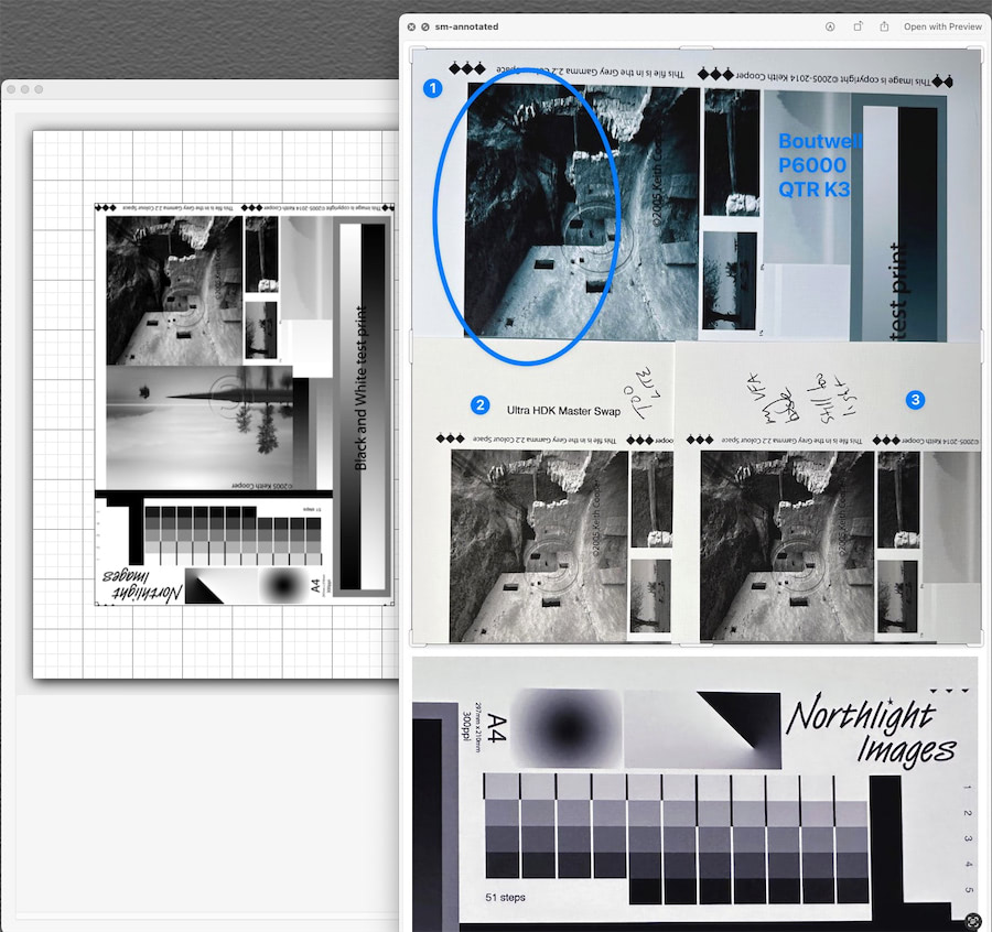
On the left of the image is the test file in PrintTool.
On the right are four sections, with the dark area I’m fighting circled. These are iPhone photos of my actual print outs.

Image 1 was created by an entirely different system: Richard Boutwell’s, QTR-K3. It makes curves from the 3 basic blacks in the K7 Epson inkset. This allows me to print using QTR on my full-color P6000.

Sort of hardware sanity test, since I used my i1Pro-3 spectro to create those K3-curves. As you can see, the cliff over-hand pretty much matches the image as it is in PrintTool, on the left.

Most of the overhang, and the inside of the collapsed room (center top-ish) are 93-98% K values, and in the original image are intentionally difficult to look into, to stress test shadow performance. Keith says that the overhang, the collapsed room wall (with hte log laying across it) should be “very difficult” to see into. (It’s the exact situation that Piezography excels at!)

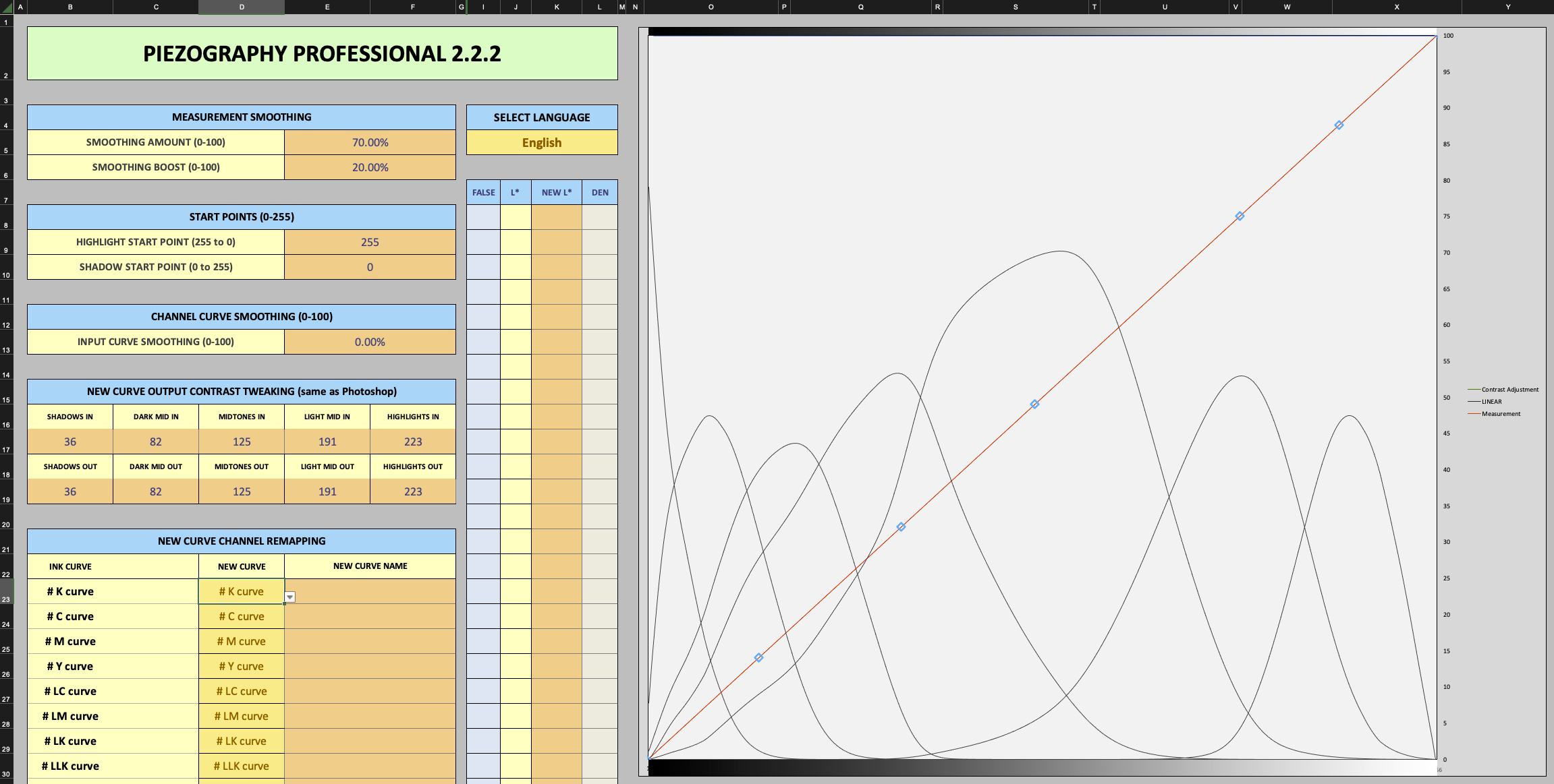
Image 2 was printed after creating a new curve from scratch. That is, I printed the target “Piezography-256step-i1Pro3.tif” via PrintTool with no color management, on a number of different matte papers. I would read one of those prints, and save the M0 values. Then I put the MO value (for a given paper) into the spreadsheet (Piezography Professional 2.2.2.xlsb) “measured” tab and used the supplied 3880 UltraHDKMaster curve (starter) as the “source”. From that I created the first curve for the given paper.

Once that is done, I reprint the “Piezography-256step-i1Pro3.tif” using that new curve. Then repeat the process, but this time using the newly-created paper curve as the “source” in the spreadsheet.

Finally, save that out as a curve from the spreadsheet, and I should have a final curve for a particular paper. That’s when I print my test image, as seen in the attached.

AFAIK, this is how you build a curve for a give paper from scratch. (If this is wrong, someone let me know, as the closer I get to 80, the more inattentive and forgetful I seem to become.)

As I said, Image #2 in the attached is a photo of that print.

That’s is when the problem was exposed.

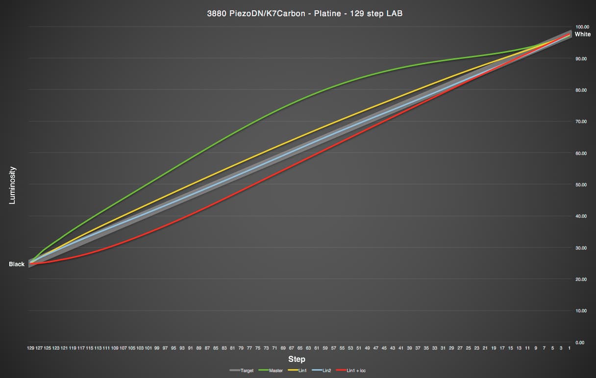
In the past 24 hours, I printed out the test image 16 times on the same paper stock, but using my various previous curves. The intent was to find the curve that printed the darkest shadows, and came the closest to looking like the original test image in PrintTool. (in case you’re interested, Velvet Fina Art was the darkest, followed by Arches 88 and Epson Legacy Fibre.)

So my most recent test, was that I printed “Piezography-256step-i1Pro3.tif” using the VFA curve, let it dry last night, and read it this morning. Put those M0 readings into the spreadsheet, and VFA as the source, and created a new curve from that.

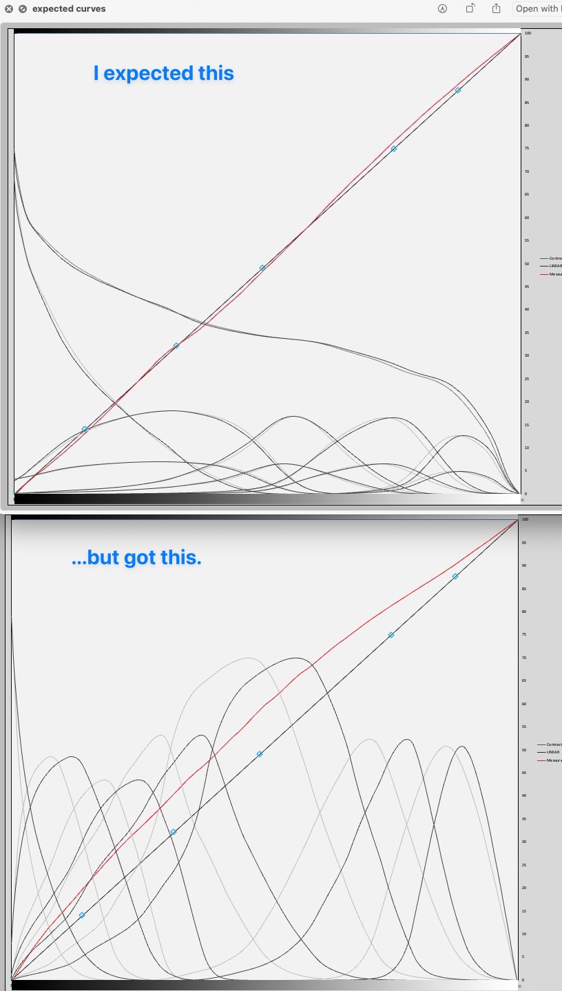
Image #3 is a the photo of that print. As you can see, it’s greatly improved from image #2, but you can also see that it’s still too light.

(I’ll admit that to my own eye, I actually like the print with that last curve, since it strikes me as more natural than the extreme shadows of the test image, but that’s not the point, is it? I need to be able to adjust my image on screen, and unless I can print what I see onscreen, the whole process turns to fairy dust…)

Finally, at the botton of the screen is a photo snipped from today’s print (#3) of the 51 patch strip. It both looks fine and measures correctly. So I’m discarding a screw up of inks as a possible cause.

I’m now wondering if the spreadsheet is out of whack. I’m using the unaltered one, straight from the Piezo package.

Sort of glad that this happened on Black Friday, since I’m burning through ink and paper here, and ordered up a $$$ bunch of bottles… :slight_smile:

As before, comments suggestions et al and etc are welcome.

Scratching my head here, as I’m sure you are too.

Any chance you still have the V2 spectro? Maybe you could run through your steps with the previous device and confirm/deny it’s spectro related.

Do I still have the v2 spectro? Nope. Couldn’t afford the new one without selling the old one. Burnt bridges etc… :slight_smile:

As a sanity test, I printed the calibration chart, to see each individual ink, and it all looks correct to me. There are no incorrect / doubled inks.

I’m down to a few possibilities that I can think of.

  1. I’m doing something wrong
  2. there is a problem with the calibration target, “Piezography-256step-i1Pro3.tif”
  3. the “K7-SEL-UltraHDMK-MASTER.quad” is off, or I’m using it wrong
  4. there is a problem with the spreadsheet (or I changed something, but it’s a fresh copy).
  5. the update to V3 spectro changed the M0 output, throwing the spreadsheet off.
  6. the Mac Studio hardware (unlikely) or the change to MacOS Ventura (much more likely) is at fault.

Comments:

  1. not like that hasn’t happened before, but honestly I’ve made hundreds and hundreds of profile and curves.
  2. probably not, but a few years back, with previous release, the target was in fact, incorrect and Walker replaced it.
  3. not likely
  4. also not likely
  5. probably not, or there would be a well-known stink about it
  6. hmmm…

Thanks for your interest. The quest continues today…

Well, I wonder if this is the problem…

…After spending another 7 hours on this today, I finally wised up, and loaded the Piezography-256step-i1Pro3.tif into Photoshop.

Turns out there are not 256 steps in it, there are about half that number. Reading from the top to bottom of any given column, there are about 7 or 8 different K values in each.

Now, that may be by design, I don’t know, but by the inclusion of “256 step” I’d have expected different.

T

Hi Tracy,

If you are only looking at K values you are misinterpreting the data because 8-bit K values in Ps are a percent scale from 0 to 100 showing only whole numbers. If you look at 8-bit RGB values instead you will see a change of 1 from each step to the next going from 255 (white) to 0 (black). I did just verify this.

Sorry I can’t really help with your specific spectro since I have no experience with either i1Pro 3 or i1Pro2, nor with Ventura. I do have an original i1Pro but have only used it with ColorPort. I much prefer my SpyderPrint which works just fine with Monterey on my MacPro trashcan.

Going back to the PPE graph screenshots you posted at the beginning of this topic, if I’m reading it right, you are showing the K7-SEL-UltraHDMK-MASTER.quad curve along with measurements produced from it. That’s not necessarily a bad first result on a paper that you haven’t profiled before. What happened when you used the new curve?

Here is what I see with just the master curve pasted in and no measurements:

It appears to be slightly different than yours based on what I can tell from comparing the relative left-right positions of the tall curve (shade 5 I think) in the middle. On mine it looks closer to center; on yours the gray one looks shifted slightly left and the black one shifted slightly right. (The gray is the starting curve, and the black is the corrected once measurements are entered.) That seems a little peculiar. The full path to the curve I used is Piezography > Curves > 3800-3880-K7 > K7-SEL-UltraHDMK-MASTER.quad. It’s probably just an optical illusion.

Maybe having a look at the PPE for each stage would help. And showing a scan or picture of your print made with the IJM master quad side-by-side with a print using the “linearized” quad derived from it might also be illuminating.

The really weird thing that I almost commented on earlier is that to my eyes in the scans of the prints you showed above I much prefer the tonal rendering of the 3880/K7 samples that you are describing as too light compared to the P6000, and in the original image the shadows just look like empty darkness. One thing that the print with your wacky profile reveals is that there actually is good stuff buried in those heavy shadows.

Keith

First, Keith, let me thank you for your time and courtesy pursuing this with me. Misery loves company! :slight_smile:

I do agree that the image looks better with the curve I’m complaining about, but that’s the wrong criteria. What I need a print that matches my (carefully calibrated and profiled) monitor. The image IS very black, was the intent of the photographer, and his measurement match mine.

You can freely download the original image here:

I have already posted a side-by-side photo of the prints I made, in my post beginning “Here’s today’s results. I’ve attached an image.” above.

Finally, here are my measurements of columns 0 and N. They indicate some serious problems in the dark tones, with Column N missing over 50% of the tones it should have:

column O
2
2
1
0
Column N
30
29 28?
27 26?
25
24 23?
22
21 20?
19 18?
17 16
15
14 13?
12 11?
10 9?
8 7?
6
5
4
3

(The left most number is the value of the patch. There are 18 of them. Those with the question marks show the missing? next number. For example the reading goes from goes from 8 in row 14 to 6 in row 15. Where is 7?)
As you can see, in Column N , there are 10 values missing, which is to say it’s over 50% incorrect.

As the columns are lighter, the problems are not as bad. Column H, for example has 2 147 values (in rows 4 and 5)

So it appears to me that the Target is pretty seriously messed up if there are indeed supposed to be 256 different values.

Again my thanks. “Curiouser and curiouser…”

A wonderfully apt description of this rabbit hole. :wink:

I think maybe I wasn’t quite clear about a couple of things. My first paragraph was only in regards to what you wrote in the post immediately preceding mine which I quote above. Since you referred to viewing it in Ps and to the K values, I assumed you meant the K values displayed in the info panel which is limited to whole number percent values. It cannot display 256 discreet values since it only goes from 0-100 rounded to the nearest whole number, hence only 7-8 values in each column. On the other hand, the RGB values can and do display all 256 values for the target. There is nothing wrong with the target file itself unless somehow yours has been corrupted. If you are talking about spectro readings of print values, that would be something else altogether.

Thanks for pointing me to the comparison that I missed, I think because the left one is labeled with the name of the quad it was printed with but the right one isn’t I didn’t recognize that it is exactly what I asked to see. Oops. But I can see that the new curve is clearly a step in the right direction. Have you done another iteration starting from that one?

I primarily make digital negatives to print in the darkroom with Pt/Pd and other so-called alternative processes. Because of the nature of these processes even the smallest inconsistency gets magnified and can easily throw off the linearization process. As such, it is normal to have to make 3 or more iterations before I am satisfied with a particular curve.

What you are doing here starting from the master curve for your printer and inkset to create a linearized curve for a new paper is not really so different from what I do, though you are unlikely to see any of the really wacky things that some of the more complicated darkroom processes can pull out of the hat. (I’m thinking of carbon transfer especially.) One thing that I have found very useful is to plot the results of each stage of my linearization process, from the first print with the master curve through however many iterations it takes to get to linear, on the same graph. Here is an example:

Green = Master
Yellow = 1st Lin
Blue = 2nd lin
Red = 1st Lin + ICC (derived from it)

I show this to you to suggest that you may actually be on the right track after all.

Three more questions:
What is M0 data? I know it’s part of the Profiler output, but is it LAB values or something else?
Are those numbers you posted above (columns N and O) K readings from Ps or something else?
Is there any chance the target file may have been tagged when you opened it in Ps? It should remain untagged.

Keith

target is fine (I’ve done literally thousands of Lins with that one).

Occams Razor says it’s the OS. Try a different computer to change that variable.

-Walker

1 Like