Most all Pt/Pd printers, myself included, have found that Hahnemuhle Platinum Rag performs much better with the addition of Tween 20 or PhotoFlo to the mix. We see the effect primarily in how smooth the tones are and, to a lesser extent, maximum density. If you are pleased with your results then no problem, but it might also be a case of “you don’t know what you’re missing”. 
As for Na2 or other restrainers, I wrote about this at length in another thread. I do not use it to increase contrast, but rather at the minimum effective amount to eliminate fog. At this low amount it actually increase the tonal scale slightly over using none at all. If you are sure that you have no fog, then no worries. In the best of all possible worlds, that would always be the case. But most of us experience a slight amount of fog when using no restrainer at all, even if it is only visible when you have an image area that should be paper white directly adjacent to actual uncoated paper white. If you print with brush stroke edges showing you may never notice this even if it is occurring. To check for it, measure an uncoated spot on the edge of your test print and compare that to step 1. If they are the same then you are in good shape. If step 1 reads even slightly more density than uncoated paper then you have fog.
The PrintTool upgrade adds some features specifically for digital negatives. Unfortunately for PiezoDN users, they all involve inverting the image so we can’t use them since PiezoDN inverts via the curve itself. At least that’s how it looks to me.
Format Space shows your image size in pixels and the image mode, for example 5040x6840 Gray:16. This and embedded profile are informational only in that you can’t change them here. Thanks for mentioning the Embedded Profile! That is important and should always be Gray Gamma 2.2.
Try printing again using No Color Management and your linearized QTR curve, just like when you printed the linearization target. Which raises another question: When you printed the linearization target were you sure you used No Color Management? If you printed that with an ICC you will need to go back and redo it without.
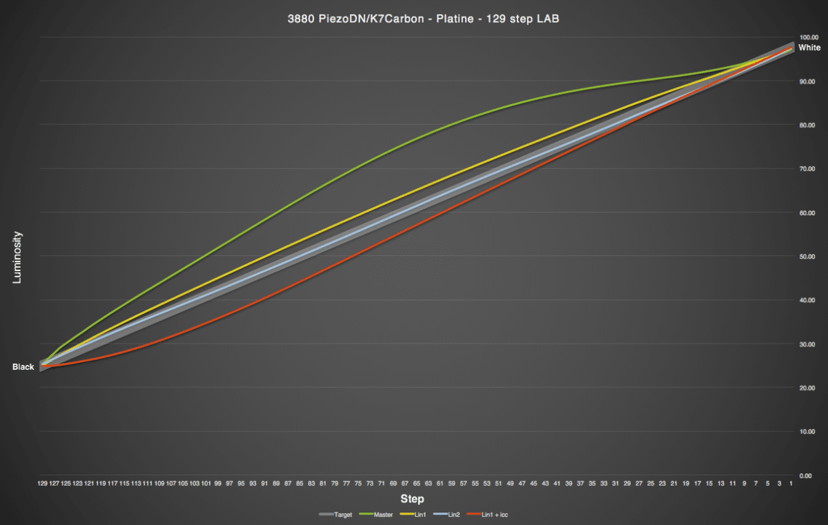
In the graph, the wide gray line represents linear - this is what we are looking to achieve. Above the gray line is too light, below is too dark. There is some acceptable margin of error which is why I made it wider. The green line is the result from my first print with the Master quad. The upper highlights are good but the rest of it is too light, in particular the flat area from around step 9 through 50 or so is very compressed indicating little tonal separation in this range. The yellow line is the first linearization. It is close but still slightly on the light side. From the CGATS data derived from this print I then did 2 things. First, I made a second linearization, represented by the blue line; and second, I made an ICC profile, represented by the red line. The second linearization is almost perfect, and probably about as close to perfect as we can get with hand-coated processes. The ICC shows exactly what Walker said to expect: deepened shadows at the cost of some compression in that region where the curve flattens out approaching black from around step 110 through 129, and increased contrast through the rest of the scale.
In general when looking at these graphs, the steeper the line the higher the contrast. But increasing contrast in one region always decreases it somewhere else, and vice versa. Always. No exceptions.