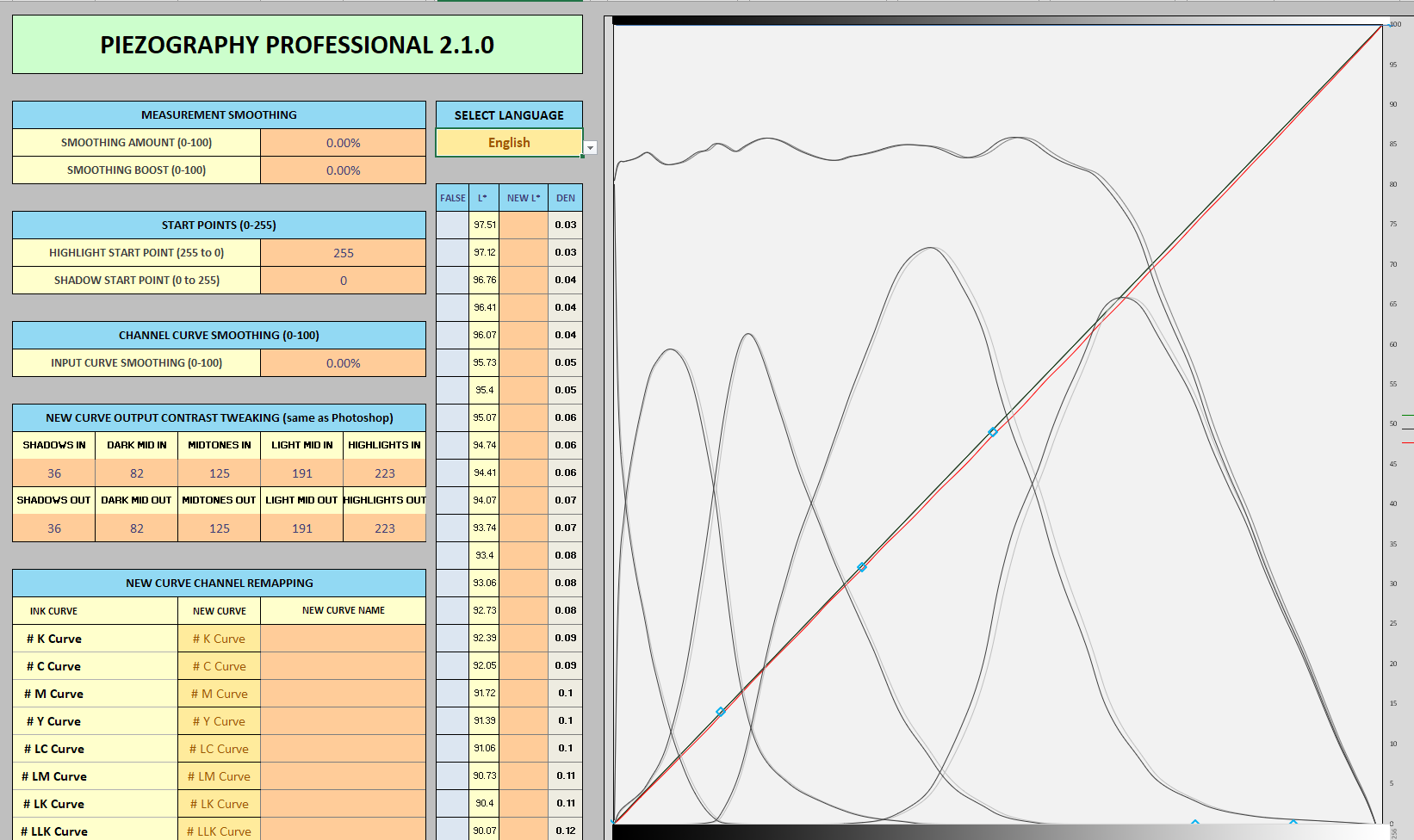
In the PPE tool, the legend for the individual curve lines in the graph indicates “grey” for the starting curve, and “black” for the new curve. As I observe how the curves are being adjusted as I go through my calibrations, it seems to me maybe these are reversed.
My interpretation of what PPE needs to do with my measurement data in this case is very slightly lighten things, especially in the midtones. But the graph indicates PPE is shifting the curves LEFT for the New Curve, which I think would have the result of making things darker.
As best I can tell, PPE seems to be going in the correct direction in the actual New Curve data (though it overshoots a bit and I’m having to do several iterations to compensate), so maybe this is just an error in the legend. Is the legend correct and if so, where am I going wrong in my thinking?
Nope. Think of it all on the x-axis. What the screenshot above is showing you is that the light tones are shifting left towards the dark tones slightly (thus increasing the lightness).
Also, the data above is darn linear. The difference is so small it would not be noticeable to the human eyeball.
Ah, yes. It’s that “X axis vs. Y axis” thinking trap which I’ve fallen into before
I have to remember that we are shifting ink density (Y value for the individual curves) to the left which has the result of making the range of pixel values (X axis for the individual curves) lighter.
I guess I can plead that some of my confusion came from having the linearization curve and the quad ink density curves on the same chart. These two data sets have different meanings for the axes, especially Y, so one must be really careful when interpreting.