Hello all – I’ve just completed a set-up of a P600 with Piezography Pro inks and have printed my first set of targets for linearization of Hahn Agave. I used the Hahn Bamboo curves to print them and am using an i1Pro to measure.
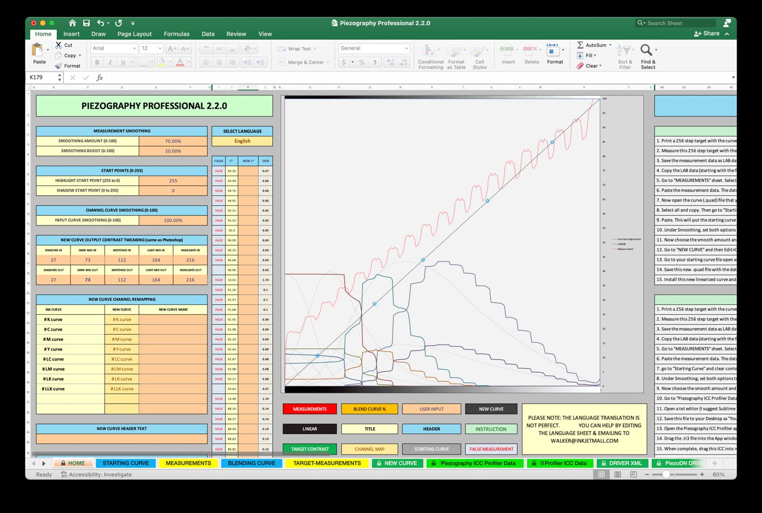
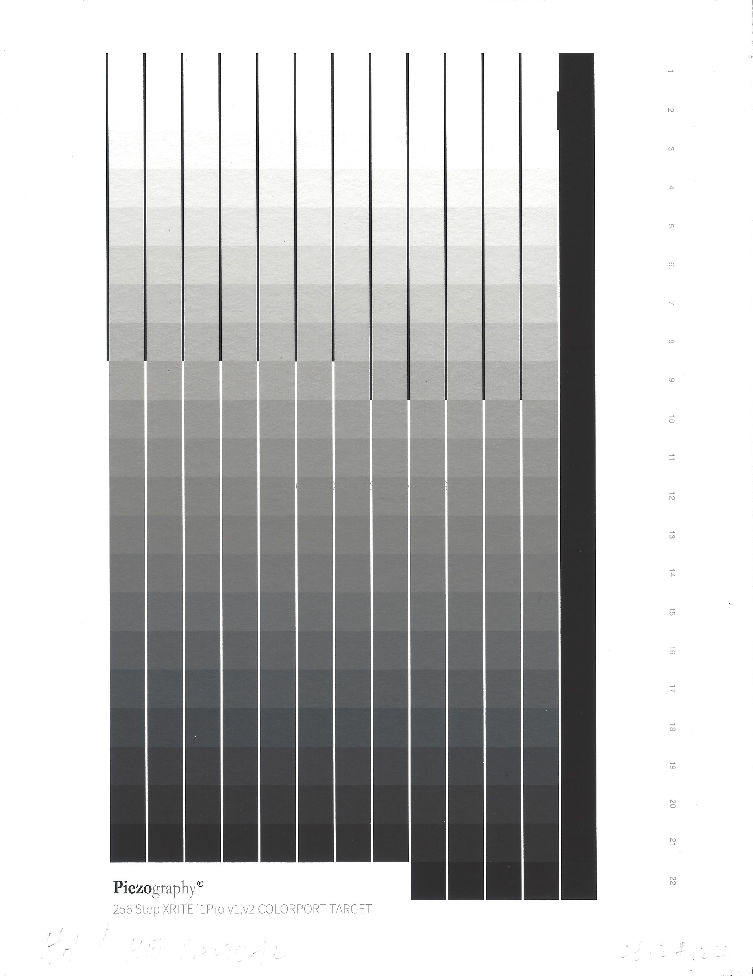
I’m getting very strange measurements (see below) and need some guidance as to what the problem might be. Also including a scan of the printed target. The cool and warm graphs look basically the same as the neutral. One possibility I can see – I shipped the i1Pro since I used it last (very well packed), and following the shipment, I traveled with it in carry-on baggage. Is it possible it was thus somehow damaged? Hopefully there’s another cause for this…
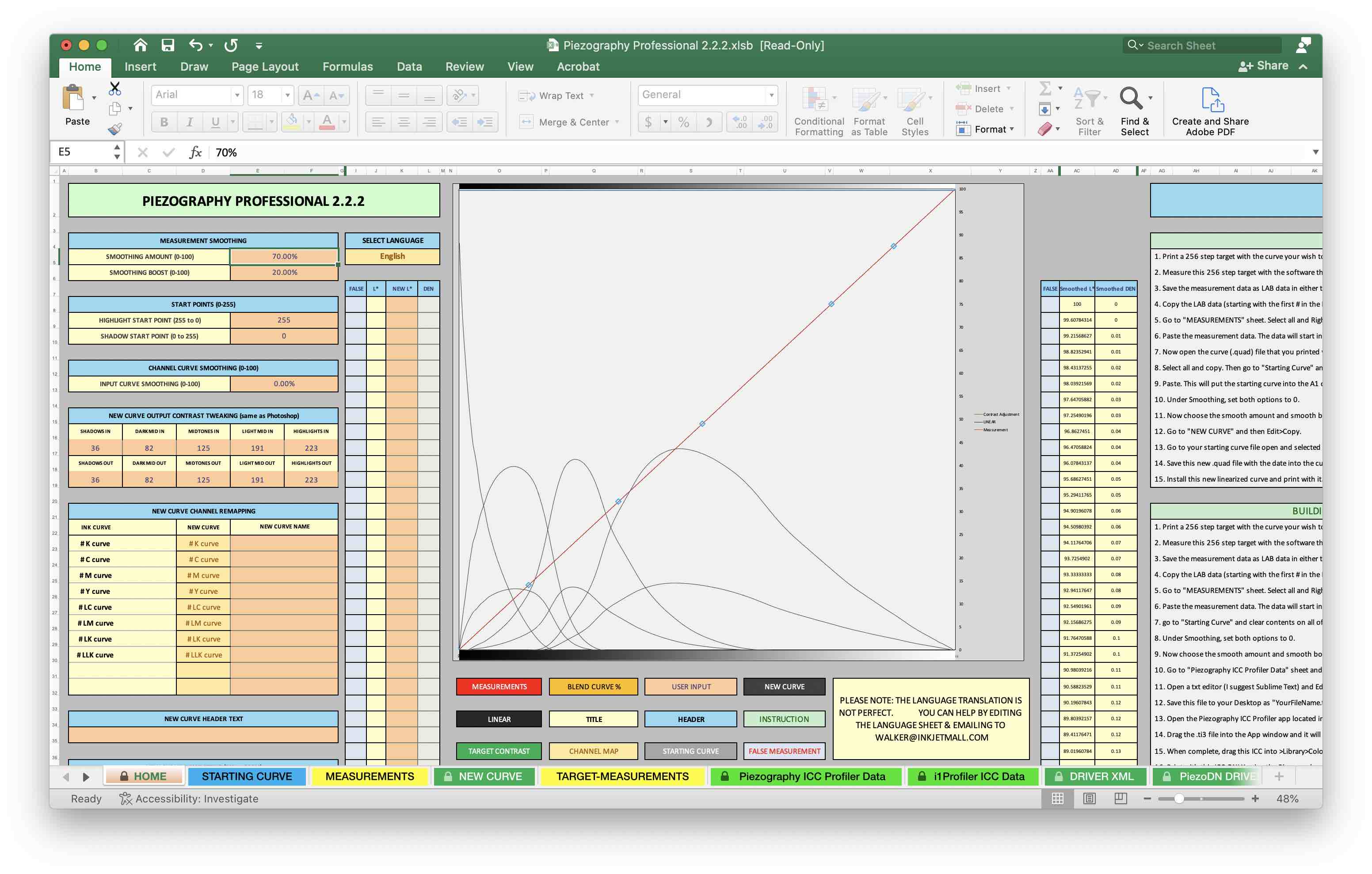
The reason I ask is something is off with that graph, even as it pertains to the starting curves. I just loaded that curve “P600-Hahn-Bamboo-Neutral.quad” into the Starting Curve worksheet of PPE 2.2.2, cleared the measurements, and this is the graph.
I just loaded these in my PPE 2.2.2 and got the same results, so we know it’s not a spreadsheet error. Thinking about your spectro being set to Spot, I think you are on to something there. Give one of these targets another measurement and see what happens.
Also, when looking at the graph closely on my laptop, I see that the strange curves in your graph are not representative of the “Starting Curve”, but the “New Curve.” I never realized PPE2 shows that. Learn something new every day!
Note: I sent this yesterday by email but today it appears not to have been posted. Apologies if the following is a duplicate. A few typos have been corrected and more detail added.
Hi Jeff,
One thing right off the bat is that your first and last measurement values must be the highest and lowest respectively. If they are not you must change manually them so that they are. The screenshot is a bit fuzzy but it looks like the highest value is the first one that is not marked false. It looks like 96.96, but I’m not sure. All the numbers above it look like 94.xx and 95.xx with maybe one 96.xx - this is why the upper end of the red line doesn’t go to the corner. They one following the 96.96 looks like 14.x2 though the graph doesn’t seem to reflect that. Could that be a reading of the black strip on the right edge of the target? Are you using spot or strip mode with the I1? If spot, don’t read the solid black column. Its purpose is to indicate the end of the row in strip mode.
Due to the uncanny regularity of the peak and valley pattern, is it possible that you have read the target left to right rather than right to left? I know that is unlikely, but I’m pretty sure that would create a result like this. Also, notice that almost all of the input values in the screenshot are marked false.
As jsking noted, the gray lines indicate the starting curve, but only after you have added measurements. In this case, it seems to be shifted too far to the left, with the Dark curves being cut off near their peaks and only the lowest part of the K curve visible at the lower left corner. I can’t come up with any explanation for that.
Thanks to both of you for your input. After Keith raised the question of which direction I was reading, I realized I’d been reading the targets left to right.
I’ve read many targets with this spectro, but it’s been about a year since the last time I used it. Guess I’m developing late onset dyslexia! At any rate, I did another reading in the correct direction and things have returned to normal. Relieved it’s operator error and not a problem with the spectro.