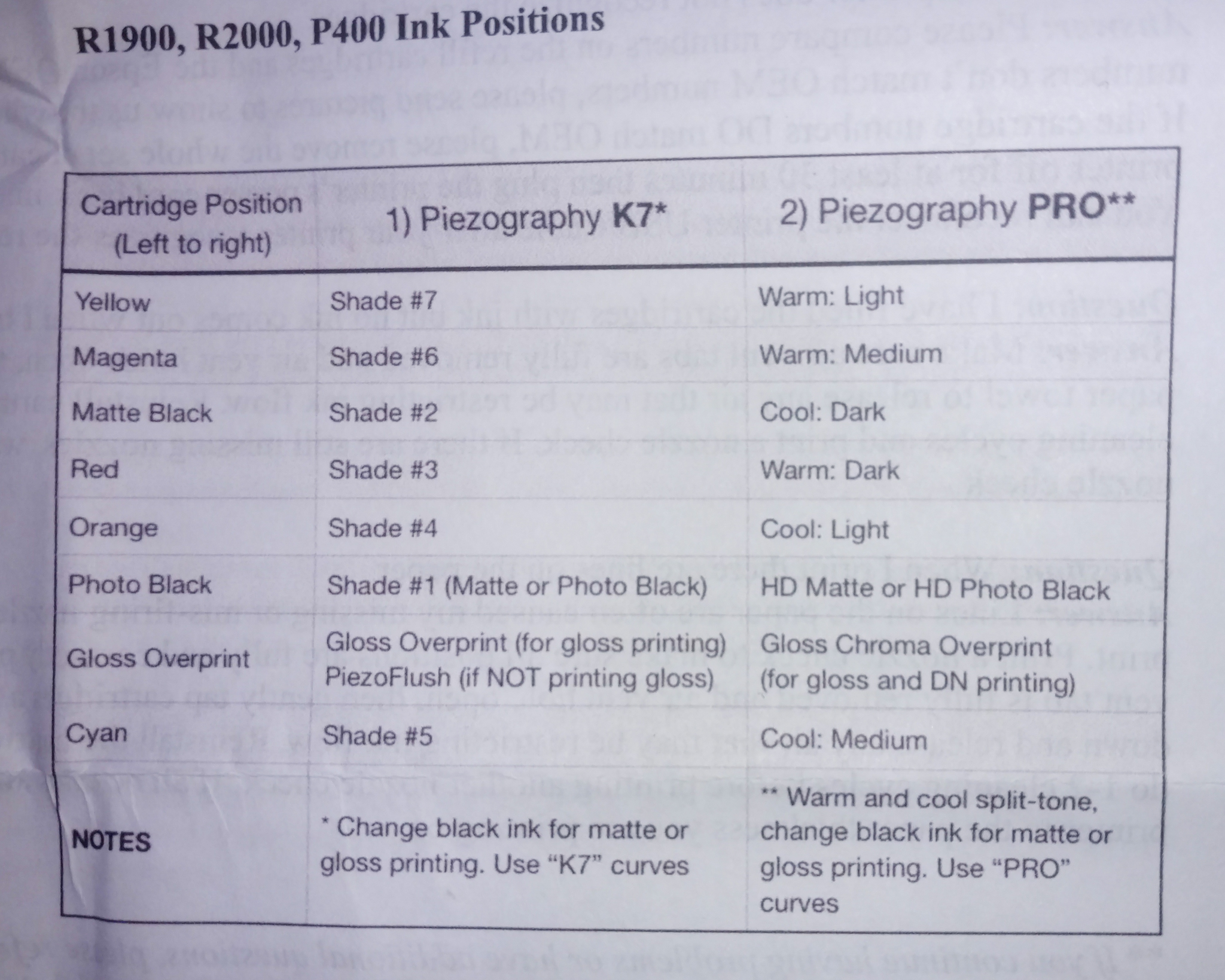
I’m just starting to tinker with Piezography in my P400. The ink positions listed online here are different from those listed on the hardcopy instructions that came with my carts (see image, apologies for the crappy cell phone pic!)
The yellow and magenta positions are the same between the two, all other positions are different. Matte black is not specified online, so I assume that’s for the Gloss Optimizer (assuming that listing is correct?)
Can anyone with first hand knowledge point me in the right direction?
Thanks!
Brad
Need to add: using Piezography Pro inks! (Like I said, just starting to tinker…) 
Hi Brad,
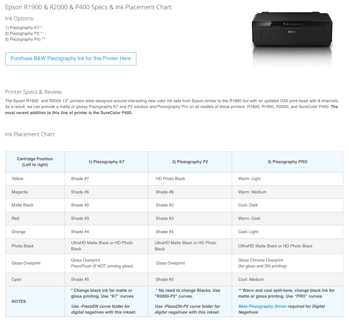
Good catch! It looks to me that the online chart in your link above is in error since the MK channel is missing entirely. There is also a chart on the Piezography site that is in agreement with the paper chart in your picture. Choose Piezography Printers & Ink Placement Charts | Piezography
(Click P400 in the Piezography Pro K4 column.)
[center]
[/center]
Hopefully @PiezographySupport will respond to this soon with a definitive answer. I would wait until you hear from him before installing inks.
Keith
Not sure what you are talking about here.
Yellow and Magenta are Light and Medium respectively, Photo Black is your black channel (for either Matte or Photo Black ink) and this is the same for the website.
The MK channel (for this type of printer model, and for over 12 yrs btw) has never actually had Matte Black piezography ink in it.
Please actually read the charts.
-Walker
Walker,
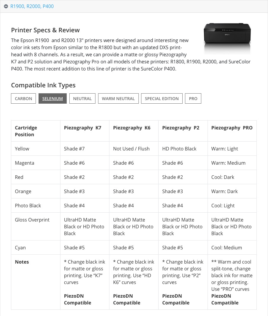
If you check the link that Brad provided in his first post you will see what he is talking about. It is from the IJM site. The one on the Piezography site that I linked to is quite different.
Here is a screenshot of the IJM chart:
[center]
[/center]
Cheers,
Keith
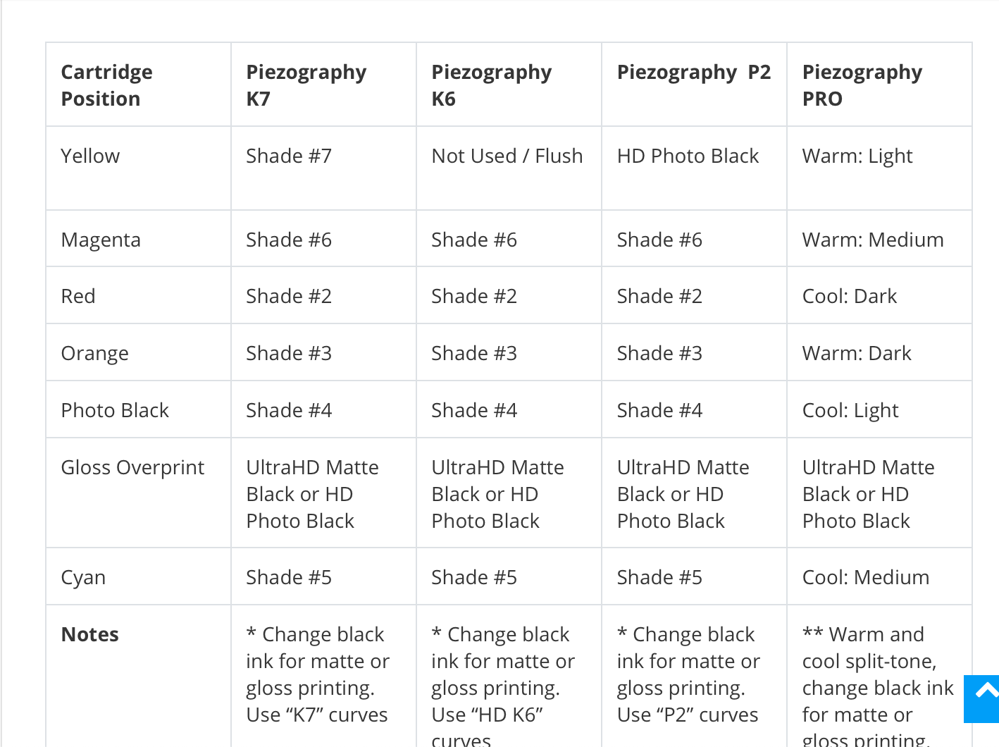
Unfortunately, Walker, it’s not simple at all. Below is a screen shot of the ink position chart linked from the Piezography Community Edition and referenced above. As you can see, it clearly stipulates that the red position gets Cool:Dark ink. The photo included in my initial post clearly show that Warm:Dark ink in the red position. There are discrepancies in the Orange, Photo Black and Gloss Overprint positions as well. Cyan is consistent between the two references.
I hope it’s clear that I have in fact, read the documentation quite thoroughly.
Keith - thank you for you constructive input.
I see, this is indeed wrong on the IJM site. I will fix shortly.
Should be as follows:
Yellow: Warm Light
Magenta: Warm Medium
Red: Warm Dark
Orange: Cool Light
Cyan: Cool Mediu
Matte Black: Cool Dark
Photo Black: Black (PK or MK)
I was looking at the wrong link
Thanks, Walker. I’m sure you have an unbelievable amount of documentation to keep track of, supporting all the permutations of inks and printers. Thank you for taking the time to chase this down and set me straight. I’m looking forward to start printing here in the next few days!
Brad