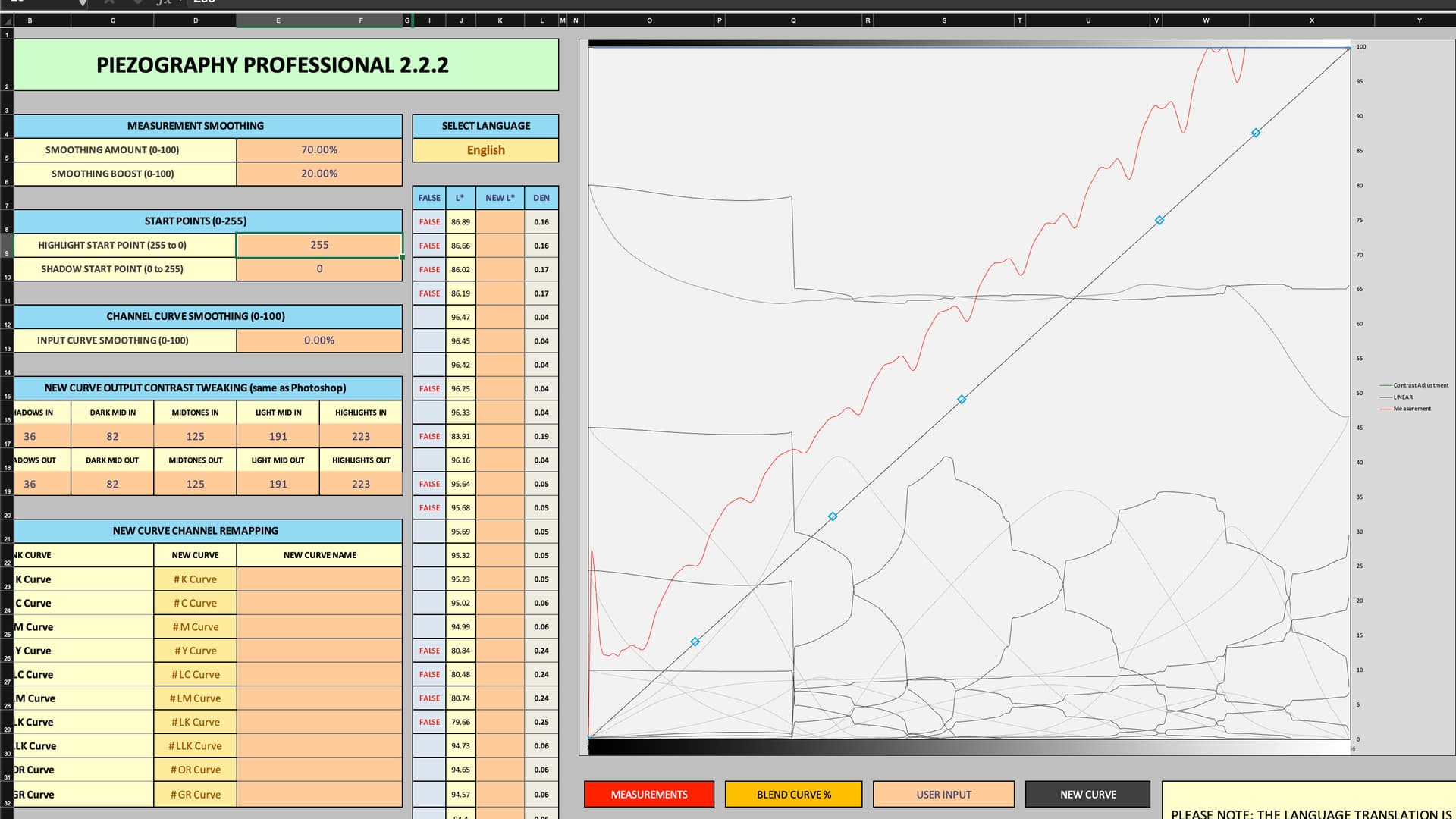
I am making new quads for Red River Palo Duro Softgloss Rag on Pro inks on my 9900. This is my first time really trying to do this process. I had done a test before but I used the entirely wrong paper and did some better research and understanding on how to get a better starting point. I used Hahnenmuhle Photo Rag Pearl as my starting quad. I printed the 256-step target for i1Pro2. I measured three targets, one each for cool, neutral, and warm. I saved the measurements as CGATs L*a*b* and copied the values into the pro excel tool.
Here is my starting graph with the defaults applied, the starting quad loaded, and my measurements input:
I also noticed that over 100 of the 256 steps are FALSE. I’ve read around that the middle values don’t matter much and that smoothing will take care of that, but it seems wrong that so many of them are False. Did I pick a bad starting paper for this? They seem similar enough in composition and style. If I am only to worry about the top 3-4 values and bottom 3-4 values, what I’m reading says to set them close to what they are supposed to be. I’m afraid that I don’t know what they are supposed to be? For creating the quad, should I just adjust the numbers there until the red graph line is close to the solid standard? Sorry if I am missing something clear in the documentation.
That doesn’t look right. Please send me your entire PPETv2 xls and the raw measurement files you used for it. I’ll put my eye on it rather than ask you 20 questions.
Hand measurement tools like the pro2 are notoriously hard to get smooth readings with. You’re best off spot-reading each patch individually. I know it’s a pain, but it’s worth it. It’ll work 10x better if you have a 129 or even a 21 step (grain of salt plz) target with perfect readings than more patches with sketchy readings. Export txt cgats with lab only, no other values. Paste into excel and only copy the LAB values and paste them into your measurements tab. If still bad turn smoothing to 75 and smooth boost to 50. Careful with smoothing, it can mess up your gradients and tonal separations, so less is more— smoother readings is key to less smoothing. Don’t make the curve totally smooth, allow a little jittering, just a little.
finally, be sure the make a NEW document in gray gamma 2.2, 16bit, 360dpi and drag in images printed before with full tunnel ranges as well as very dark and very bright images. At the bottom, use the gradient tool to make a gradient from one side of the document to the other from black to white. Under that, make a step wedge from scratch.; use the marquee tool to make a black rectangle, then make little squares from left or right and fill each one manually with correct RGB values and label them; 2, 4, 6, 8, 10, 12, 14, etc up to 24– once you linearize the curve, print this and evaluate how it matches your screen. Make adjustments using the curve contrast adjustment tool in the main page of PPE2. This will effectively put a Photoshop-esque curve on the .quad, which you can print again and again, gradually adjusting the S-curve until the step ledge matches your screen, as well as all the images for this specific paper. You will definitely have a different curve that is much less dramatic for glass paper and another one that’s much bigger adjustment for Matte papers. The brilliance of this is that you don’t even need a calibrated screen, necessarily, you can adjust the curve until the .quad matches whatever screen you have. It will be basically a perfect screen to print match every single time without soft proofing. It’s a brilliant system and has made printing such a joy, don’t even bother with linear soft proofing work clothes it is frustrating and inaccurate no matter what you do.
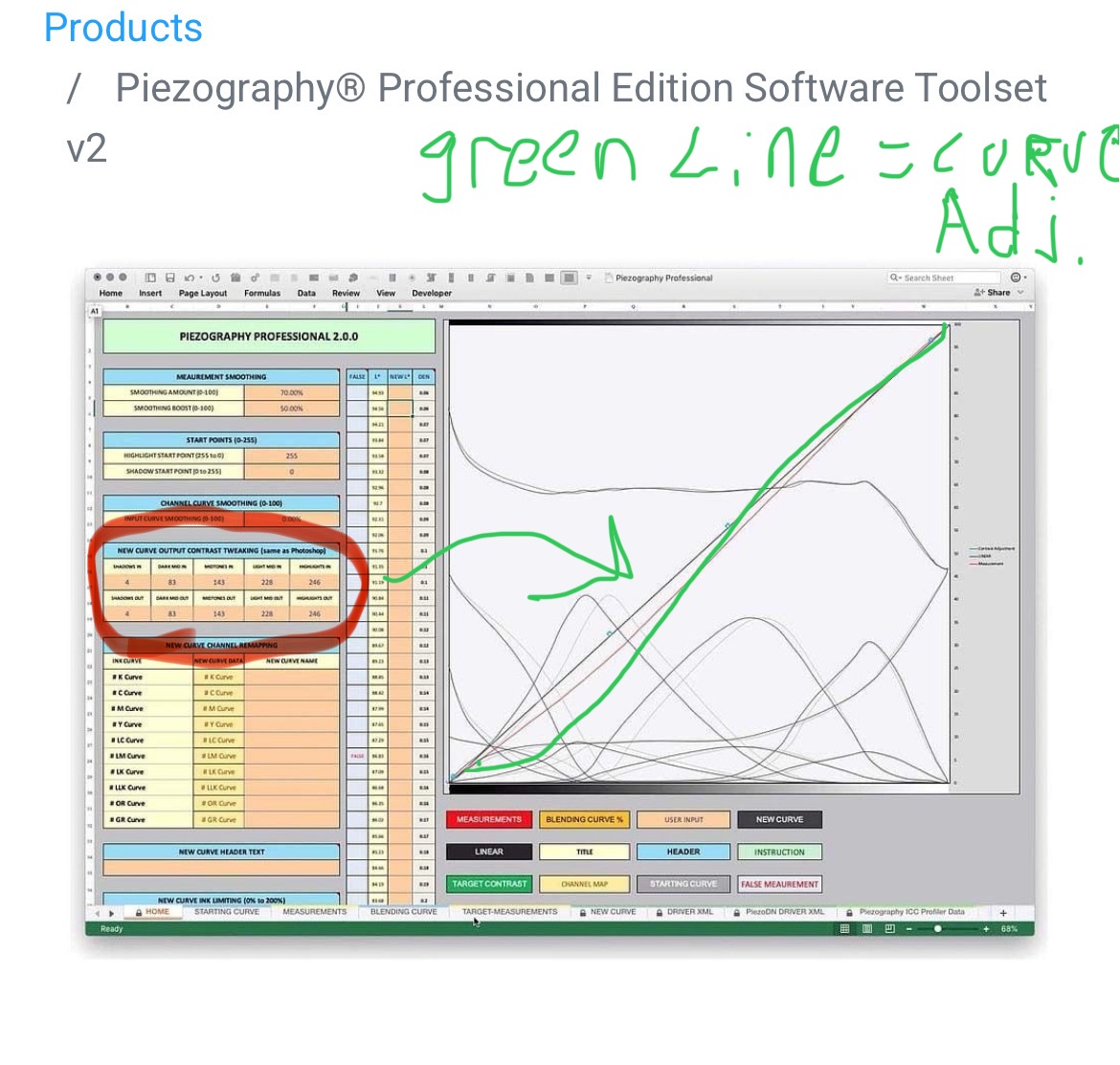
If this confuses you, look up contrast adjustment on this forum, and you will see other people doing it, including myself with screenshots to illustrate