I printed the 256 target for ICC profiling. Waited 2 days and measured them, saved file as cgatscielab. Followed the video instructions, cleared starting curve, cleared previous measurements, pasted new measurements. Then copied and saved from Piezography ICC profile data to ti3, and got this error when dropping into ICC profiler:
./colprof: Error - CGATS file read error : Unable to open file ‘/Users/bkmac/Desktop/Piezo.ti3’ for reading
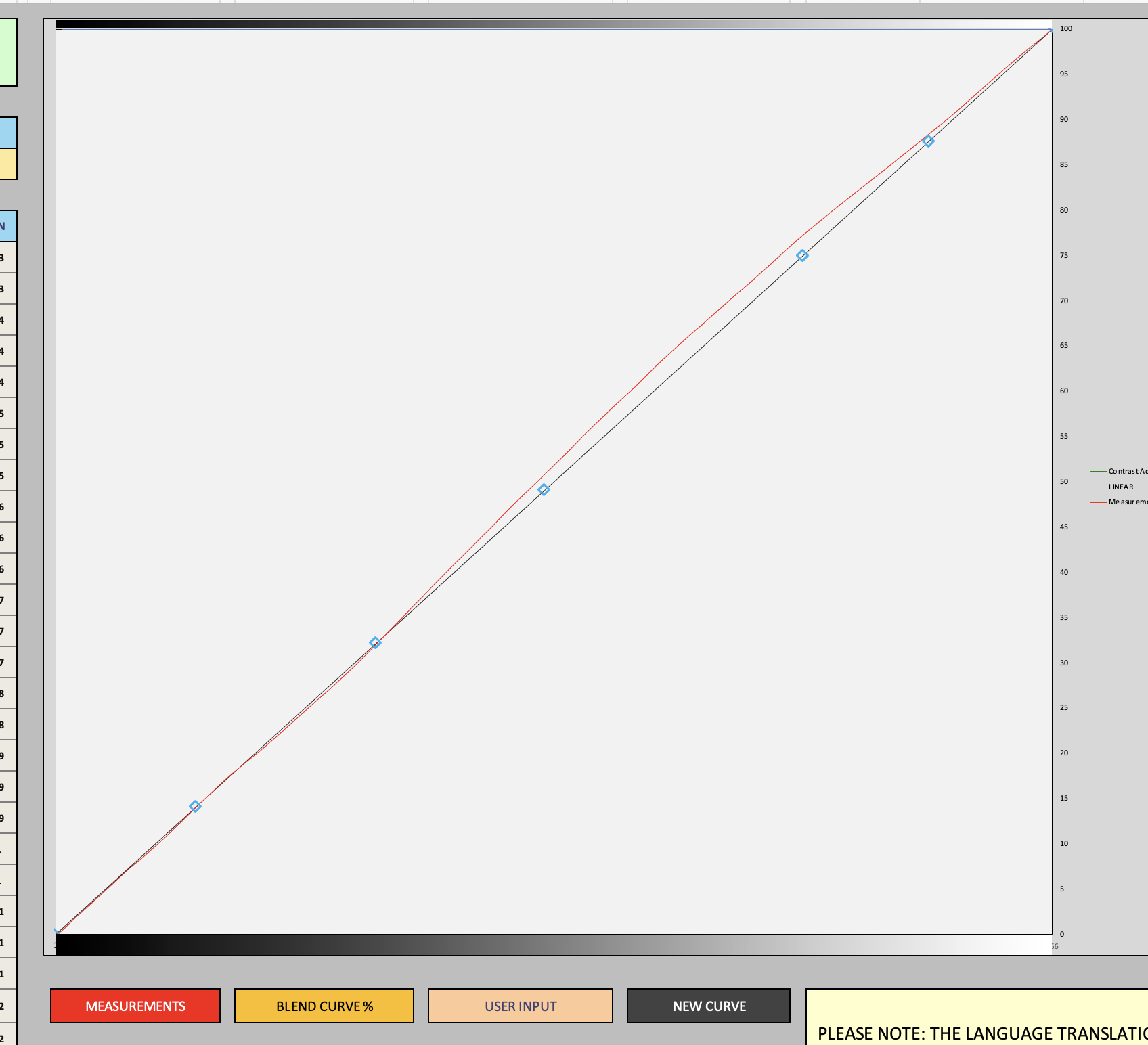
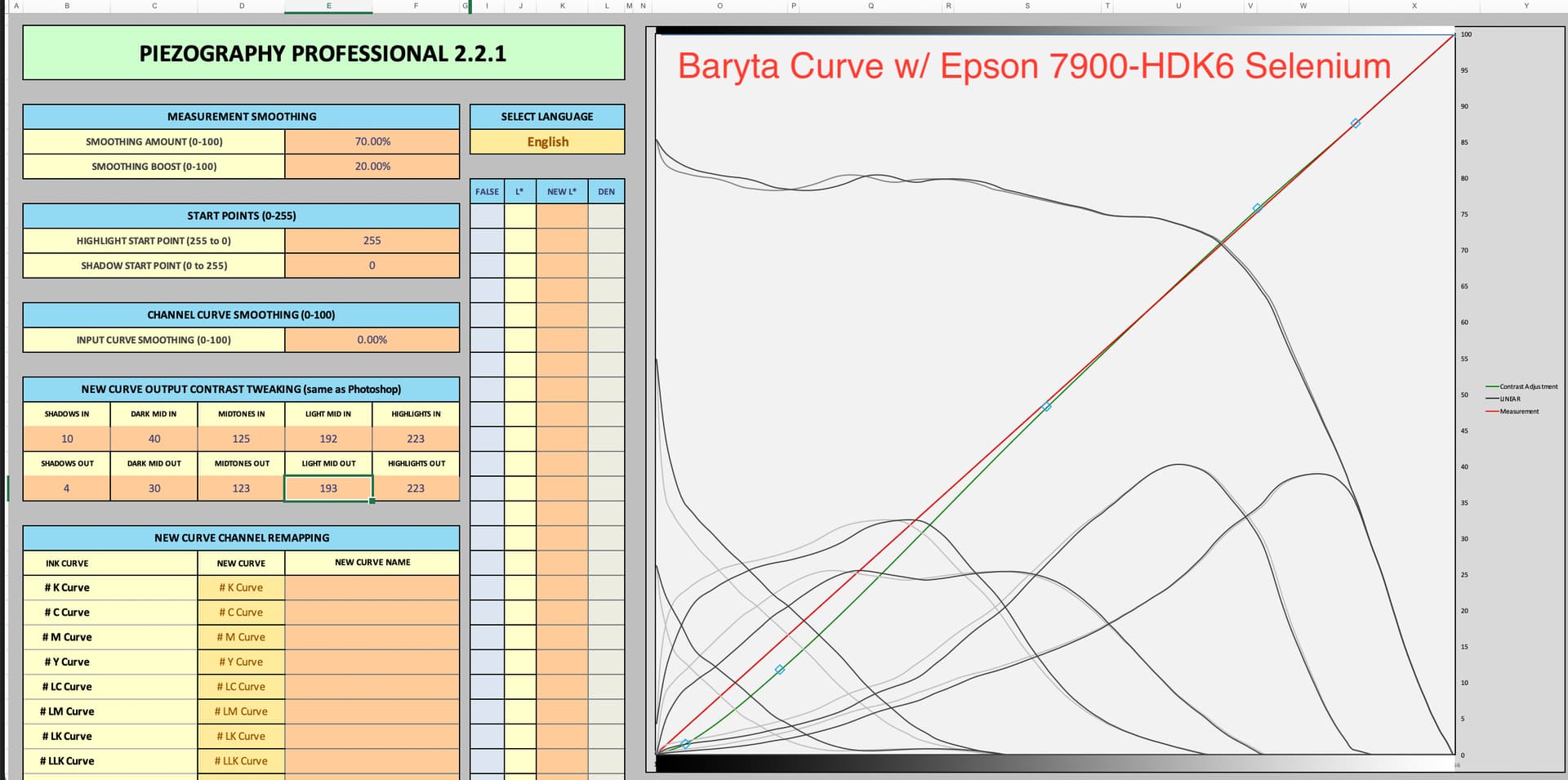
When I insert the 256 measurements I get this chart. Do I need to do something about the red line varying from the backline. Does the new quad or new ICC alter that red line to create a perfectly linear end print or do I need to massage that redline, and how, to make in conform to the black line?
But you don’t need the ICC at all. Much much better printing (better dmax with not BPC but good shadow rendition) is with the Matte/Gloss contrast intent curves I mentioned in previous thread.
Pop those number in along with your curve along with your measurements and the new curve will print exceptionally with No CM out of Print-Tool/QTR. Better than when using any ICC.
So be clear, I am loading the starting curves from my Canson and Moab quads in starting curve, then loading the measurements based on those starting curves and then re-setting New Curve Output to the In and Out settings you posted?
I’m trying to set up an accurate soft proof in PhotoShop. Or is it always better to print out of Print tool? And then in Print tool what do I need to soft proof properly?
And one last question, the red line is not dead on the black line, should it be in order for it to be linearized?
So it doesn’t matter if the correction you’re giving me, the new curve out put contrast tweak was based on a different paper than I use? Is that because the starting curve is the one I created with my specific papers?
But I’d still like to soft proof in PS because in PS I can print from an unsaved variation to hard proof, make corrections ion PS and gard proof again. All of that hopefully based first on a soft proof. But in Print-tool I can tweak aspects ion the image on the run. I have to do it i PS, save the image, and then put it in Print tool.
And Again, do I need to in any step of the linearization or profile creation processes need to make the red line exactly match the black line? In assume the red line is the actual non linear measurement and the black line is the goal. Once I create a new curve has it matched the measurement (red line) onto the black line?
I started with a quad I created that produces a very good print, and inserted that into new curve, I then applied the curve output contrast corrections and went to new curve and saved it as a quad. I then printed using that new curve no CM. The print was substantially off and not close to matching the image appearance in Print tool.
If by “produces a very good print” you mean produces a very good print with an image adjusted for linear printing then you need to open that image back up and turn soft-proofing off and adjust to your liking without soft-proofing. Then print with the adjusted “screen match” curve. And make sure the image is tagged Grey Gamma 2.2 or Adobe RGB 1998 (not ProPhoto or Dothan 20 etc)
100% with walker. The curve tweaks were a game changer for me. I label my curves with -Lin for the linearized base curve, then I have experimented with many different curve settings, but I have found a few that work for almost everything. I have one for textured matte, textured gloss, smooth matte, etc all the sort of baseline different papers. I can’t save copies of the PPE2 Tool worksheets anymore (I dunno if that’s a deliberate update but I used to be able to) so I just have screenshots of the curve point numbers in PPE2 that have corresponding names so I can easily paste whatever new Linearized curves into a new ppe2 sheet with those settings and I’m instantly set— perfect screen match contrast with no soft proofing, and without the posterizing or clipping I used to sometimes see with ICC printing.
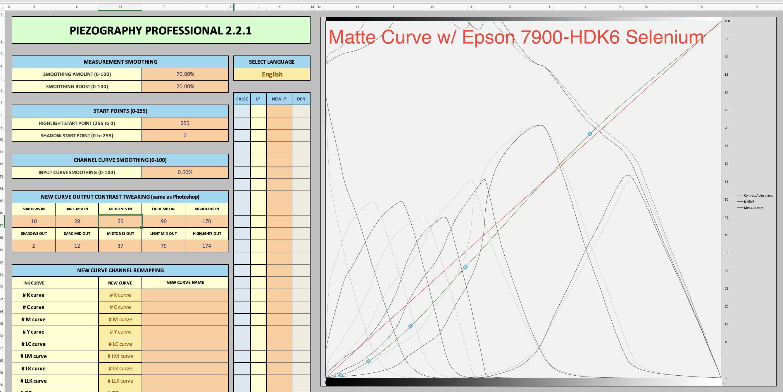
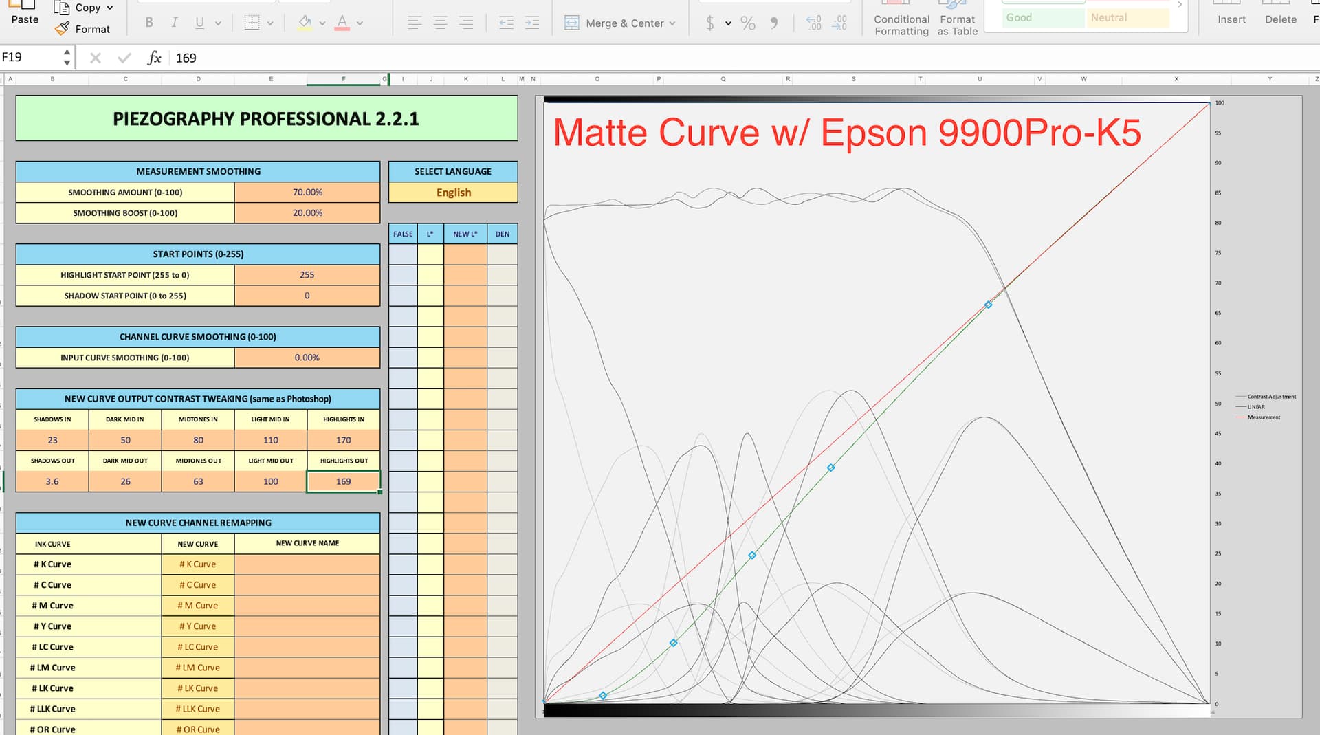
Obviously important to have your monitor calibrated for these to work best, but the great thing is you can tweak it until it matches your screen, calibrated or not. Mine is calibrated 250:1 at 120cdm adobe rgb 6000k fwiw. Attached some screenshots of my settings. CTM are matte curves, CTP are glossy curves. You will find you will need tweaks on various papers, thus the numbering system. These are my latest go-to settings for smooth matte / baryta.
Note— I have found the settings to be fairly different for screen matching my selenium K6 setup at home vs the Piezo Pro setup we have at work, although the highlight bump in the matte K6 is maybe a bit more of an artistic liberty than a strict screen match adjustment… everyone loves a brighter print.
Also, don’t try to add your measurements and unlinearized starting curve and put the contrast curve on at the same time— be sure to linearize the curve first, then clear all the data, put the linearized curve as your start curve, and then do the Contrast Tweak
This method of applying curve to the linearized profile is a hit and miss process correct? I mean you can’t see the effect unless you save and install the new curve and then see how it affects a given image. Am I wrong?
And then this is a one size fits all approach, that really doesn’t fit all as you still have to tweak the file further to get the final print result you want.
What I wanted to do, but for some reason the software is not allowing me, is to create an ICC profile for the paper and my printer that enables me to do a PS soft proof tweak that really matches what I see on the screen image to a near perfect match of the print. I’d prefer to print out of PS because in PS I can print from an unsaved file as I work on it, Print tool requires a saved version which is another step and when saving gigabyte files can really add up the time.
In a recent conversation in another thread with @PiezographySupport regarding DTP I asked, “When I started my calibration process, I applied the Contrast Tweaks to the ink-limited starting curve. I’m wondering if I should have done a linear calibration first, and then done the Contrast Tweaks. Have you played with this order of operations?”
His response, “Nope, just keep that contrast “intent” there always.”
I encourage everyone to do tests for yourself and take no ones words as gospel. I have been doing this for 10+ years and in my experience, this contrast tweak methods is by far the best. If you are making a custom ICC for each paper, then you are effectively still submitting to a “one size does not fit all” approach, but you’ll find that the results are not as smooth and clip blacks that you might otherwise have, or at least have in a more nuanced way. I would say if you are dealing with one printer, you could pretty easily get away with one curve for matte, one curve for gloss. perhaps you make a curve or two tweaked slightly differently for the oddball paper here and there, but that’s it.
Yes, initially, you will have to hard proof; tweak, install, print, tweak, install, print. But once you nail it, that’s it. No soft proofing, no hard proofing, it will be a perfect match every time.
This is the test image I use.
note-- if you’ve used this ubiquitous test image before but simply converted it to gray gamma 2.2, the step wedge values are numerically inaccurate, so it’s crucial to make your own step wedge after converting, as I have done with the targets in that link.
Don’t forget to relinearize at least twice a year I’d say. I’ve seen humidity have a big effect on how ink lays down, so I’ll usually do a winter and a summer linearization session. But once you have your curve tweak settings, simply pop the Lin curves into excel with those same settings and you won’t be doing any more tweaking, iot’s a one time deal.
I don’t know about DTP specifically, but afaik this always applies to any kind of piezography printing, whether it’s paper or DN. You have to start with a linearized curve first for sure. If you don’t you will never be able to recreate the contrast later when your environment, materials or equipment naturally drift or change in any way. You start with linear calibration as a baseline so you can always get back to it instantly, and any tweaks to the process you like can be controlled and repeated indefinitely once you bring everything back into spec later if you need to.
@bkosoff While that is the aspiration of any softproofing method, I think it’s important to remember that unfortunately, we will never get close to “near perfect match” because of one main point: transmissive image versus reflective image.
In over 25 years of doing this, what has become the most critical question for a softproofing method: is it consistent and predictable? Be it an ICC-based color management method, transfer curves in Photoshop, or Contrast Tweaks in PPE2. None of them are perfect. Some are better than others. All are tools that can let you predictably and consistently make satisfying prints.
The best analogy @bill and I used with clients at K2 Press was softproofing is like pulling Polaroids in the studio to examine lighting setups before shooting film. The Polaroid was close enough to let us know the lighting ratios and exposure setting were correct, but they were never near perfect match to the film.
I don’t think you are wrong, but your mental model of what is happening here is incorrect. I’m working on another post about screen matching that hopefully sheds some light on this topic. For now, think of the contrast tweaks as “modifying the linearized .quad” with the adjustments that used to be done with transfer curves in Photoshop. Regardless of which method we used to create monochrome ink ICC profiles, they all work around inherently limited hacks. What CEP has given us with the Contrast Tweaks is a more straightforward way to do screen matching for their system that avoids the limitation of the ICC hacks.
Stay tuned for more. This is a complicated topic that is hard to write about.
To clear here, I mean, you will need to linearize each paper first, but you will probably find one or two contrast tweak adjustment settings that you can throw on any linearized curve to get a screen match right away–no hit or miss/trial and error /hard proofing etc. The trail and error hard proofing is just for your main gloss/matte papers during initial testing but once you have the settings that match them to your screen, they will probably work on pretty much everything else. you just have to linearize first, and then apply the settings