I am printing Kallitypes using digital negatives and am seeing that the highlights are blown - so for example there is no cloud detail in the final print. Shadows and mid tones are fine.
The negatives have highlight detail and I have carried out a base exposure test (and double checked it) so the exposure time is correct.
Any thoughts as to how to correct this?
Would printing a step wedge and then creating a curve in Photoshop work or should I try a different approach?
No. I printed three negatives using the Pt/Ox curve evaluated it by eye. However, highlights aren’t printing at all, even though there is detail on the negative.
I don’t have a spectrometer at the moment and am unlikely to get one soon, so I really need to start with a process that relies on eyesight.
The problem with trying to use any “canned” curve with any alternative process is that there are so many variables involved that the chance the IJM supplied curves will work for you are fairly slim even if you were using the process that the curve was intended for. As we have been discovering, even the lightsource plays a large role. You are using a curve made for a different process which makes it next to impossible. And Kallitype is highly variable itself.
Do you have a scanner? If so, try using that. I think there are instructions in the manual. There is a 21-step tool especially for that called 21Step_Scanner_Tool.
What are you evaluating by eye, an actual image or a text target? If you already trying to print images, you have put the cart before the horse. If you are working with a test target, how are you modifying it? I think you actually ought to be able to get something that prints full-range doing this by eye, even though it will not likely be linear, but you have to evaluate it correctly and make the appropriate adjustments to the curve. For this you would use the Piezography_Curve_Adjustment tool. Since your highlights are too dense in the negative, you would shape the curve so that there will be less density in the highlights by pulling down that part of the curve. This is basically the Limiting process described in the manual.
Whatever you do, figure out all of the Kallitype printing parameters that you want to use before starting to adjust the curve, because if you change any of those mid-stream you will need to start over.
Thanks. I have been printing kallitypes using 5x4 negatives and getting good results so I have confidence in the chemical process.
you are right I have been putting the cart before the horse and printing images - one of which came out beautifully (no highlights) so I also have confidence in the PiezoDN inks.
I plan to print a step tool and will use the scanner tool to see if I can’t finally crack this conundrum!
I found even the built in Pt curve worked well for Kallitype. So, how does the histogram look on your image in editing software. Maybe monitor image is uncalibrated so that the image looks good on screen but if you look at histogram the image is pushed up the the right. Just a thought.
Hey Charles and Shane - Why don’t you guys exchange notes on the specifics of your Kallitype printing methods. That might shed some light on the your different results. I haven’t done Kallitype in a very long time, but for the last 2 years or so I’ve been trying to help a computer challenged friend come up with a digital negative curve for using QTR with ConeColor inks. The recurring problem is whenever we get close he goes and changes something in his darkroom procedure and we have to start over again. I was really surprised at the wide range of results he was getting, and wish I could remember what the changes were. Don’t forget to include your light source.
You can’t beat the human eye for the final evaluation, I agree, but measuring devices are great tools to make getting there a little easier.
As I said the supplied curve works fine for me, i have made a “kallitype curve” but its not really a whole lot different. My light box is a LED (390 nm) strip box with the lights about 120 mm off the contact frame. Exposure to max black is 7.5 min using Berger Cote 320 or Hahnemuhle Rag.
For the record if it helps:
On a 5x7 image I’m using 11 drops per solution brushed on and then cool air dried. (25 drop / solution for a 8x10)
Generally I develop for 7 min in Sodium Acetate and Tartaric Acid (75 gram / 3 gram / 1000 ml.
Clearing in 3% citric acid solution for 4 min
wash
Tone : Gold Toning using a 1% Gold and Thiourea toner from Sandy King
wash
Fix in a 5% Sodium Thiosulphate fixer with 5 ml of Ammonia added once crystals have dissolved to prevent bleaching.
I am keeping my chemistry consistent and I am using a reliable UV light box. I haven’t measured it but it gives good results with traditional negatives. The monitor is also calibrated and I get good digital prints so I don’t think it is the monitor either.
Chemistry is as follows: Paper is coated in a 50/50 mixture of Silver Nitrate and Ferric Oxalate and developed in Sodium Citrate (20% solution) with 2ml of Potassium Dichromate solution per litre of developer. Then it’s cleared and fixed all as per Sandy King’s procedure. And toned in 75% Palladium/25%Platinum mixture.
I’ll print a step table today and start tweaking a curve in photoshop.
One question - do you use fresh developer for each print? I don’t and I haven’t noticed any deterioration in tonality etc. from reusing developer a few times.
Actually I solved the problem quite simply in the end. The developer I use had 2ml Potassium Dichromate solution per litre to give abit of extra contrast to film negatives . I made up some developer without the Dichromate and that solved the problem - highlights come out perfectly on the step table and on prints.
The standard curve works fine now but I may in the future invest in a spectrometer and produce a tailored curve.
Charles - Glad you worked it out. Did seeing that Shane is not using dichromate help you find that solution? I’m asking because as soon as I saw the word dichromate in your process details I knew that was was the problem. That is exactly why I asked for those details.
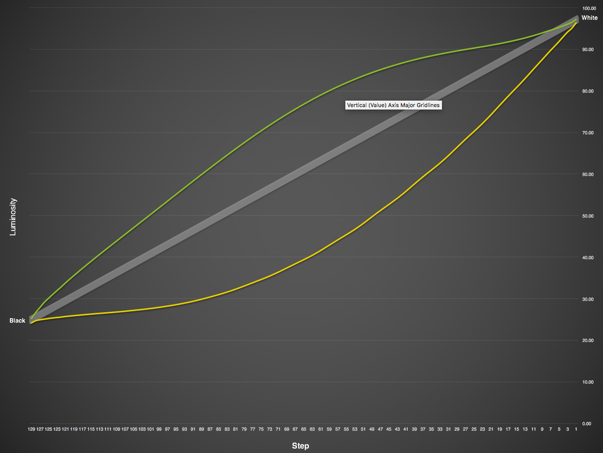
Regarding the light source, there are many types of UV light sources that use for alt-process printmaking. Saying that it is “reliable” is not useful information. Aside from the sun itself, there are several types of fluorescent, LED, and metal halide lamps being used by people on this forum alone. They all have different output characteristics that affect the response of the printed result. I think you are fairly new to this forum so maybe you haven’t seen previous threads on the subject. Let me show you an example from last month:[attachment file=26712]
Both of these are printed with negatives made using the same Master Pd curve. The green line is my Fluorescent BL unit, the yellow line is Art’s Metal Halide unit. The difference is substantial. My linearized curve would make Art’s worse, and vice-versa. My BL bulbs have peak output at around 350nm, while Art’s MH lamp peaks at around 420nm. A similar Pd print responds to these 2 light sources in very different ways.
Anyhow, that is why I asked. Best wishes with your printing.
It came to me as I made up some new developer - it seemed logical that there would be no need to add dichromate to a process involving digital negatives where the contrast is controlled within the computer and I wondered if that might be the problem.
Any way, I probably still need to tweak the curve abit but I am pleased with the results so far.
Re the light source, I am using a UV light box which is new and bought from a manufacturer - I obtained excellent results with it printing from film negatives so I was confident the light source was not the problem.
I need to check the output of the UV unit I use but the results I get from it are consistent.
One point I forgot to answer was whether Shane’s answer helped me - his chemistry is quite different to mine and so it didn’t immediately give me the idea to develop without the Dichromate. It did, however, get me thinking about what effects different developers/fixers/toners etc., have on the final image.
I use my developer until I think is getting a bit grungy, then i filter it and pour out enough so I only have 900 ml left then top up to 1000 ml with a fresh developer I’ve previously made up.
The Sodium Acetate develop is a bit blacker (but still quite warm/brown) in tone from the Citrate developer, but once you tone it I believe it takes on the toned of the toner, so really does not matter with first developer you use if toning, particular if Gold or Pt/Pd.
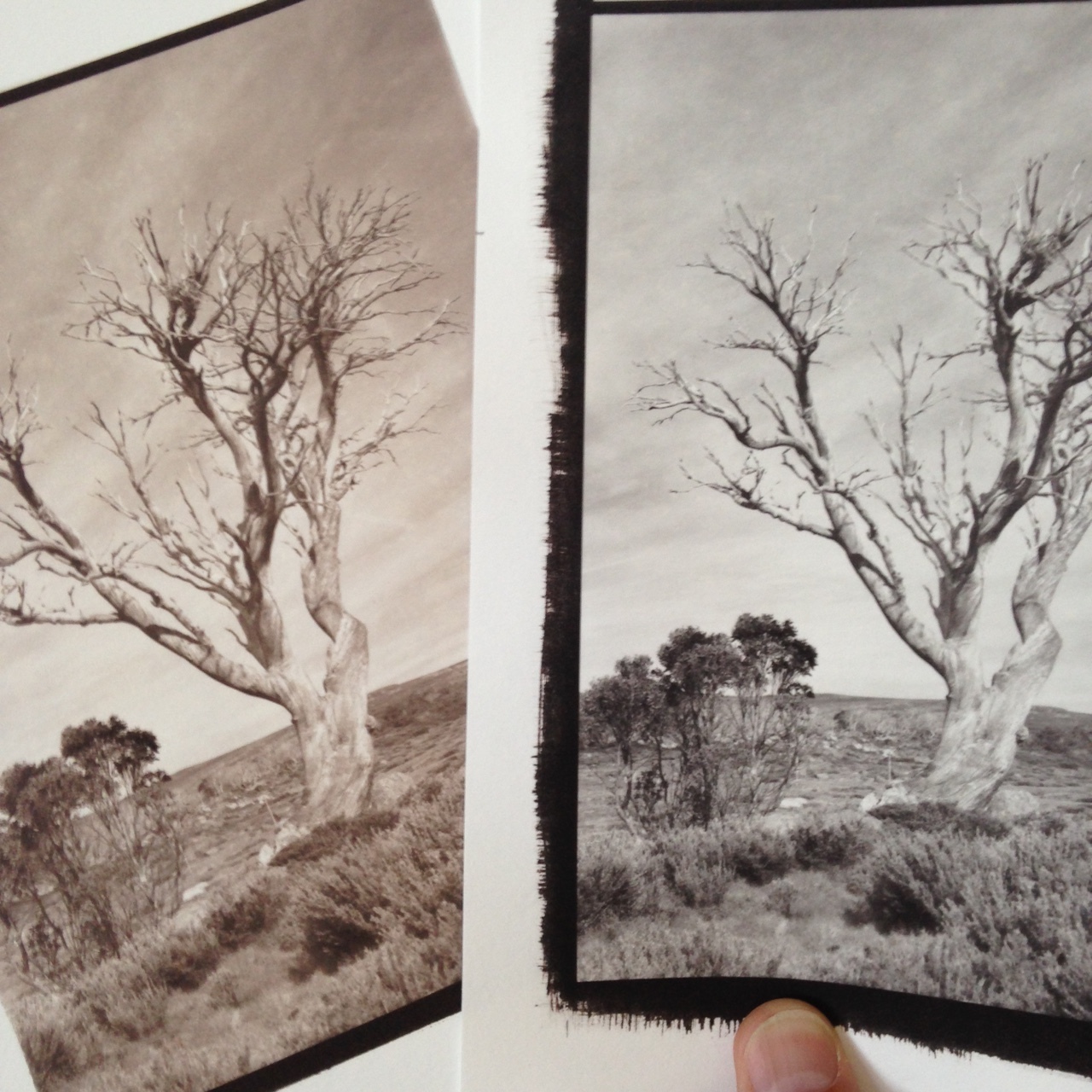
Example no tone of left (Sodium Acetate developer) and Gold tone on right, same developer.
 on the your different results. I haven’t done Kallitype in a very long time, but for the last 2 years or so I’ve been trying to help a computer challenged friend come up with a digital negative curve for using QTR with ConeColor inks. The recurring problem is whenever we get close he goes and changes something in his darkroom procedure and we have to start over again. I was really surprised at the wide range of results he was getting, and wish I could remember what the changes were. Don’t forget to include your light source.