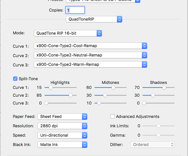
I am using the ProInk in a 9900 printer. My goal is to replicate the feel of a gelatin-silver print. I am using Cone Type 2 paper, matt ink.
My mix (see attached) is cool/neutral/warm
Highlights: 15/85/0
Midtones: 60/30/10
Shadows: 70/30/0
When I view the print under the GTI Viewing station (D5000), the print looks good. There is a little warmth which makes the print more “lively”. When I print with just the cool curve, the print has a blue cast (very cold feel).
When I view in natural light (window light), I get the same result. So the idea was to print the project with the above mix!
When I checked the prints under the gallery lighting (Soora LED, 3000K, MR16 - GU10, Vivid Light), the print looks like a Sepia print, very warm. And when I check the print with just the cool curve, it looks ok (not the very cold feel I experience under my D5000 viewing station).
I have checked the gallery lighting with order prints (gelatin silver, digital prints) and the shift between D5000 and their light is almost unnoticeable.
I am curious if someone else has had such an experience, where the shift in tonality in the piezo print is drastic under different lighting (all calibrated!).
Thanks for the advice … Oliver Klink
